Aktivtisch

2026
09
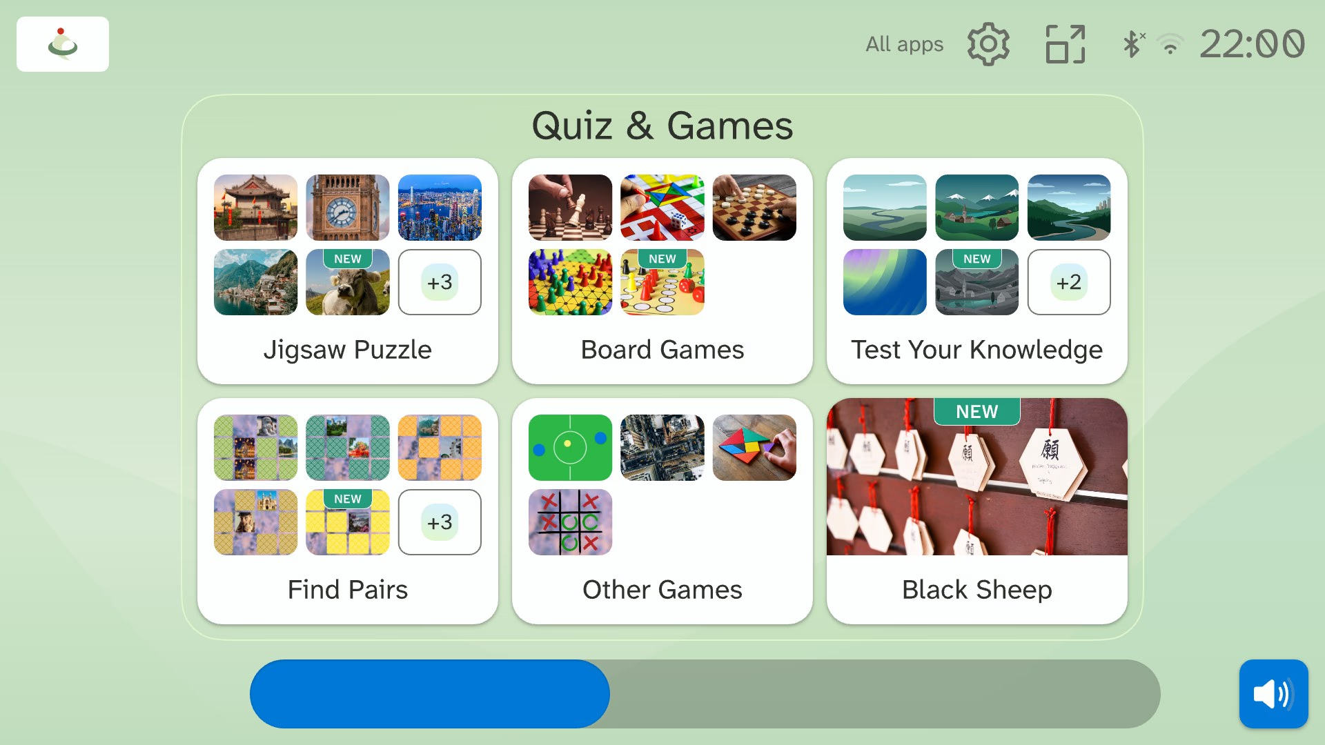
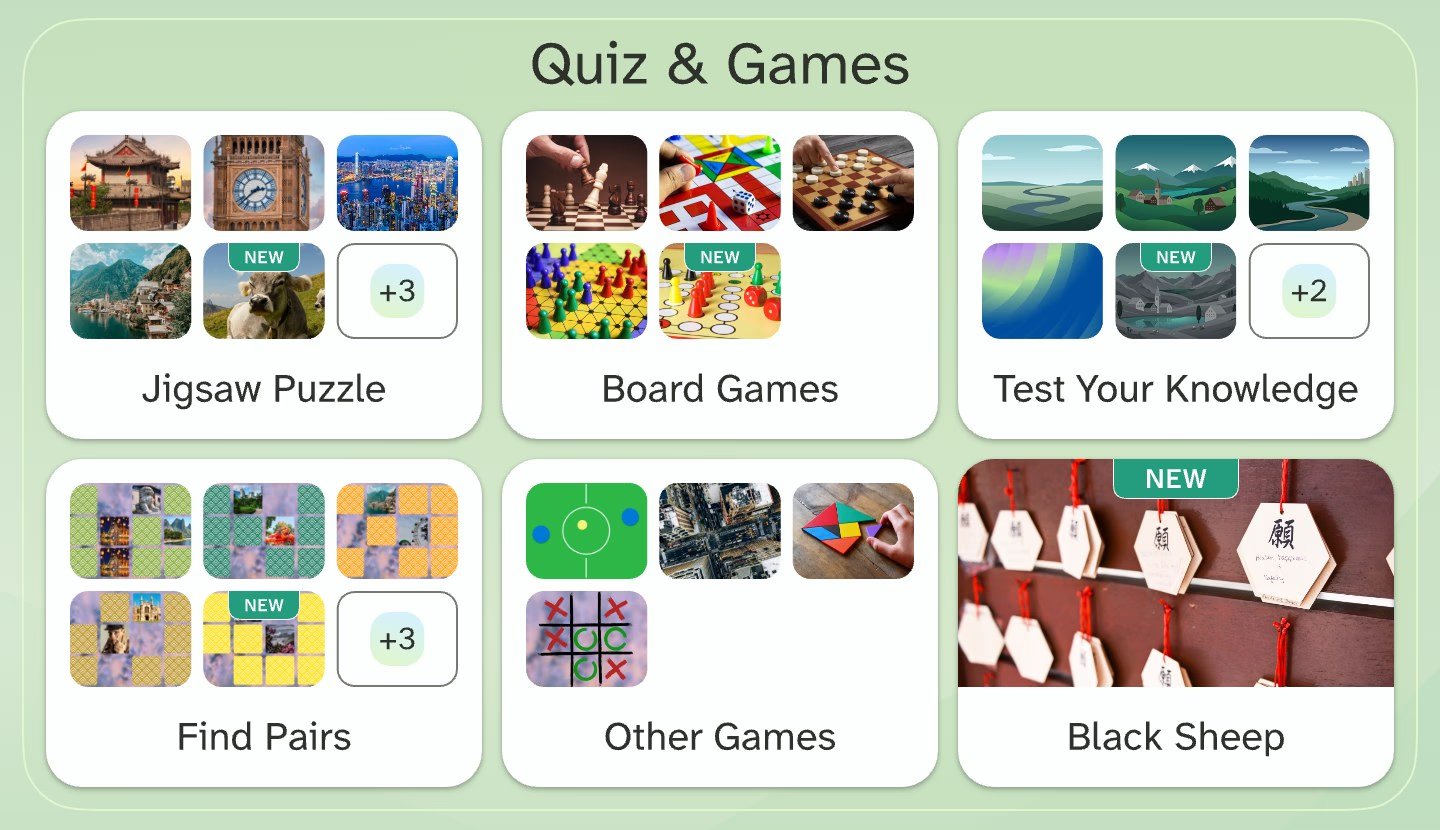
Redesigned Aktivtisch home: the Quiz & Games category with photo tiles for Jigsaw Puzzle, Board Games, Test Your Knowledge, Find Pairs, Other Games and a new Black Sheep tile.

Product design for touch, made accessible for older adults.

‍

Aktivtisch is a touchscreen activity table for care homes and disability services. I am its only product designer. I ran the research, redesigned settings and nine game apps, and built the design system.

UX/UI

Accessibility

Research

Design System

Product Management

Link

Overview

‍

Objectives

  • Learn why caregivers avoided settings.
  • Make settings, profiles and shutdown safe for untrained staff.
  • Bring nine game apps to one accessible standard.
  • Give the developers specs that explain themselves.

‍

Role: Senior Product Designer, the only product designer

Period: Aug 2025 – present

Team: Stakeholders · Unity developers · content designer · QA

Key skills: Mixed-methods research, Prioritisation, Accessibility for older adults and tremor, Touch and remote interaction design, Design systems, Prototyping and on-device testing, Design QA, Art direction

‍

Goal

Sales. Build an accessible, research-backed interface that gives care homes and investors a reason to buy.

‍

Standing apart. Profiles set Aktivtisch apart from competing tables. Make them easy enough for daily use.

‍

Consistency and scale. Build every screen and new app from one design system, so releases cost less.

‍

Daily operation. Cut the time staff spend on setup, troubleshooting and navigation.

‍

Engagement. Make sessions longer and more enjoyable with clearer type and calmer backgrounds.

‍

‍

‍

Context

‍

Three table sizes and a tablet

‍

The table comes in 43, 49 and 55 inch. Each one tilts into a table, lectern or board position. Aktivtisch GO runs the same apps on a tablet. Every layout I designed had to work on all of them.

‍

Every screen, drawn to scale. 55″ · 140 cm 49″ · 125 cm 43″ · 109 cm GO 13.1″ GO 11″
Every screen, drawn to scale

‍

Table position Lectern position Board position Aktivtisch GO

‍

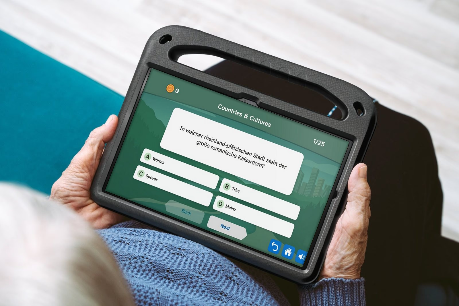
Hands holding the Aktivtisch GO tablet on a lap, showing the redesigned Test Your Knowledge quiz: a question card and four lettered answers.
Aktivtisch GO held on a lap

‍

‍

One Unity app for Windows and Android

‍

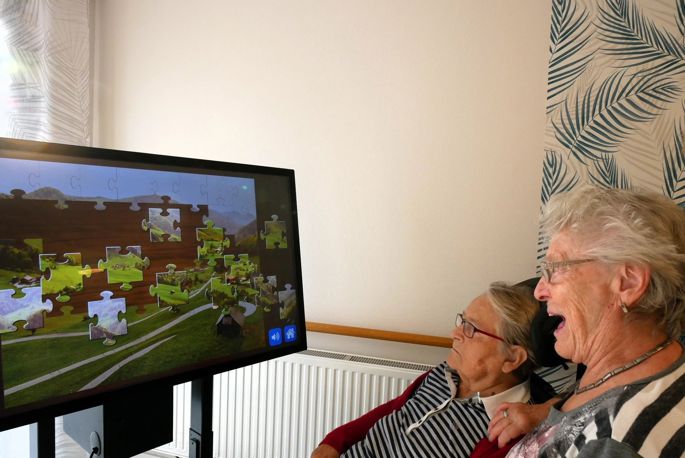
Residents watch from up to three metres away, so I kept layouts simple and legible. The table takes touch and a remote cursor. The 43-inch table runs Full HD; the 49 and 55 inch tables run 4K.

‍

A Unity app has no system controls. I designed and specified a full library of accessible custom components, down to the keyboard. Each has a 64 × 64 px minimum touch target and Atkinson Hyperlegible type.
‍

Two older women, one in a wheelchair, watching a jigsaw puzzle on the upright Aktivtisch screen; one of them is laughing.
Residents follow a jigsaw from their seats

‍

Constraints and design responses. ConstraintDesign response Viewers up to 3 m awaySimple layouts, clear hierarchy, large type Touch and a remote cursorTargets sized for finger and cursor; hover, focus and pressed states; no edge-only actions or precise gestures Full HD on 43″, 4K on 49″ and 55″Layouts built on the grid and scaled by density; images supplied in high resolution A shared, communal deviceStable layouts and safe margins that behave the same for every user A Unity app with no system controlsEvery control custom-made, with idle, hover, focus, pressed and disabled states Windows table and Android tabletThe same custom
Constraints and design responses

‍

‍

‍

Discover and define

‍

Benchmarking Aktivtisch against four competitors

‍

Buyers compare activity tables, so I benchmarked four competitors on format, training, support and features. Aktivtisch was the only table in three sizes and one of two with profiles.

‍

The benchmark, August 2025. AktivtischCareTableDeBeleefTVMedia4careTovertafel FormatTable, 43/49/55″Table, 43″Table, 43″Table 55/65″, stand 75/98″Projector Personal profilesYesnot statednot statedYesper staff login Video callsNoYesNoYes— ReachDE/AT/CH, early1,000 homes in DE1,500 homes in EuropeDE/AT, early10,000 facilities
The benchmark, August 2025

‍

‍

Caregivers run the table

‍

Research showed staff do more than 95% of the navigation. Residents tap the games. So I designed for two users at once.

‍

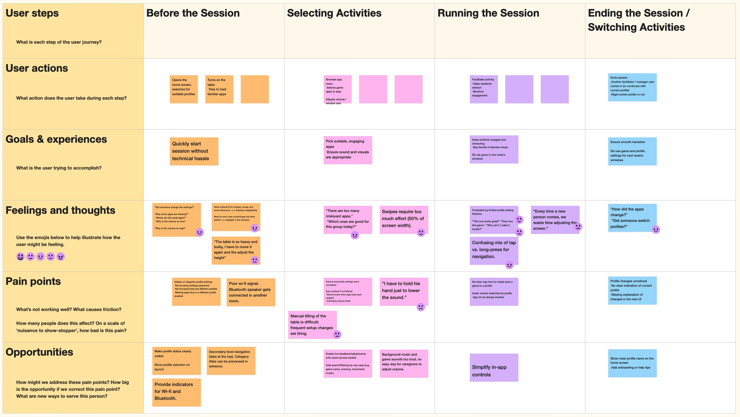
The table serves residents, caregivers who run sessions, caregivers who manage the table, and facility management. Personas are an old-school tool, but my proto-personas aligned stakeholders on these four groups. With my journey maps, they surfaced the pain points we prioritised. One was "I have to hold his hand just to lower the sound."
‍

FigJam journey map for a facilitator across Before the session, Selecting activities, Running the session and Ending the session, with rows for actions, goals, feelings, pain points and opportunities.
Journey map of a caregiver running a session

‍

‍

Three problems shaped the redesign

‍

Settings nobody trusted. I designed a survey for our client facilities. 29 of the 308 invited answered. All found launching an activity easy, yet 55% felt unsure in settings. 59% rarely or never created profiles. Their comments named problems in the most-used features, like saving changes and adding web pages.

‍

Games that punished mistakes. In a heuristic evaluation of ten apps, I coded 105 notes against an 18-question checklist. In three apps, players got no second try after a wrong answer.

‍

A screen too big to reach. On two field visits in disability care, residents could not reach the top corners. They expected a tap to work the moment their finger landed.

‍

The root cause was a mismatch. The system thought in profiles and categories; caregivers thought "open an app, run the activity, done".

‍

Client survey, November 2025, 29 of 308 facilities. Found launching an activity easy100% Rarely or never create profiles59% Feel unsure in settings55% Do not understand categories37%
Client survey, November 2025, 29 of 308 facilities

‍

Most-used features, by weighted usage score. Open desktop, used to switch off43Shut down without password29Manage albums2925% window mode27Manage web pages27Kiosk mode27Manage external services23Manage categories22Screensaver15Change logo5Remote access3
Most-used features, by weighted usage score

‍

Heuristic evaluation, 105 notes by checklist question. Checklist questionProblems notedExample from the review Does it look clean and finished?Aesthetics13Widgets are pixelated, black and white and dull (Advertising Classics)Can every element be hit and reached easily?Targets12Seated players have to stretch their arm to reach the tools (Painting)Does every action answer fast and clearly?Feedback11An answer counts only when the finger lifts off the card (Black Sheep)Are there as few pop-ups and modes as possible?Modality10Players cannot go back or skip a picture (Black Sheep)Is everything extra removed?Clutter8A busy background hides the puzzle pre
Heuristic evaluation, 105 notes by checklist question

‍

Each method, its question and limit. MethodQuestion it answeredWhat it gaveLimit Client surveyHow widespread is the trouble with settings?29 facilities, usage scores for 11 features, free text sorted by theme9.4% response; confident facilities may answer more Field visitsWhy do residents and staff struggle at the table?Reach, touch timing and random tapping, seen in 5 recorded sessionsTwo sites, both in disability care Heuristic evaluationWhich screens break basic interface rules?105 notes from 10 apps, coded against 18 questionsExpert judgement; does not replace watching players Flow auditWhere does the shipped settings flow fai
Each method, its question and limit

‍

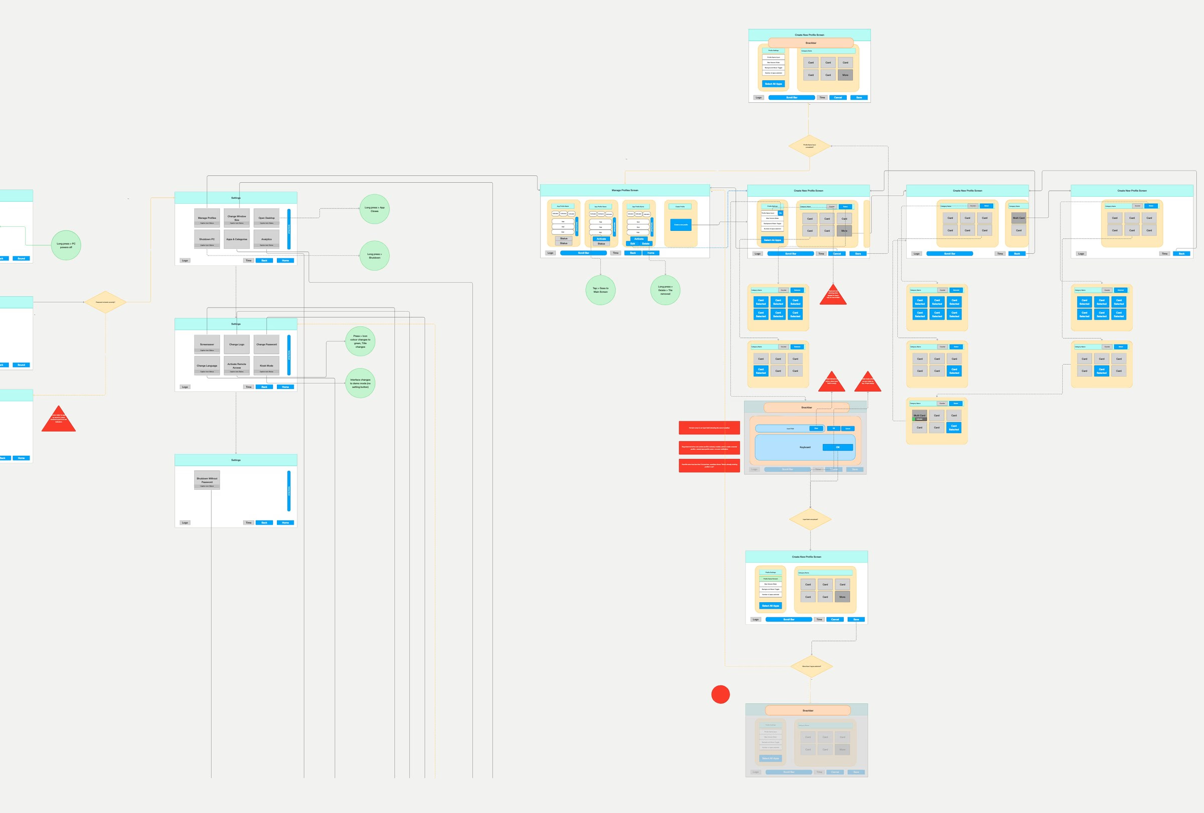
Wireflow of the legacy settings and profile creation, with decision points, long-press and tap notes, and red warning markers on defects.
The shipped settings flow, 22 defects marked

‍

‍

‍

Prioritise

‍

Ranking 123 ideas before building any

‍

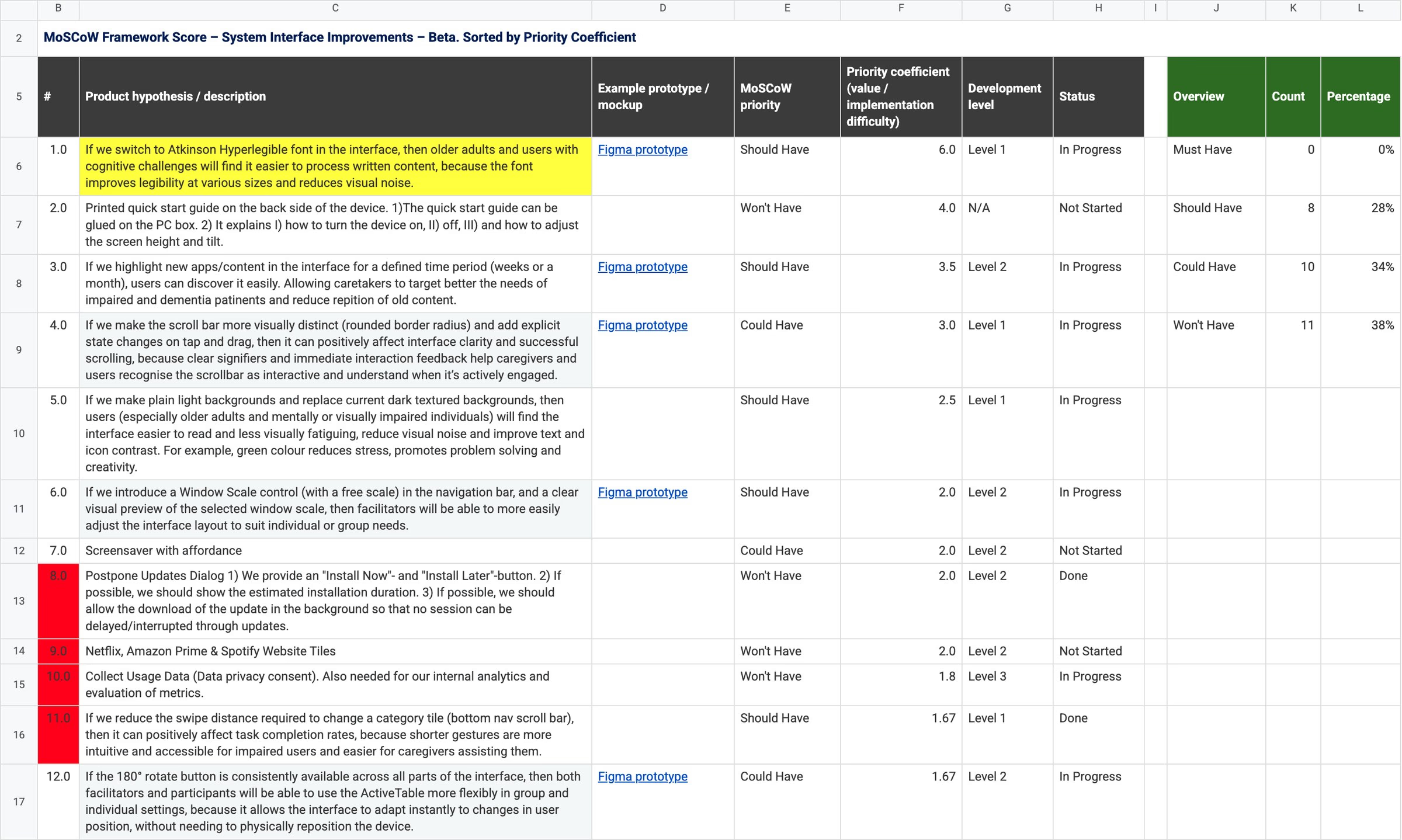
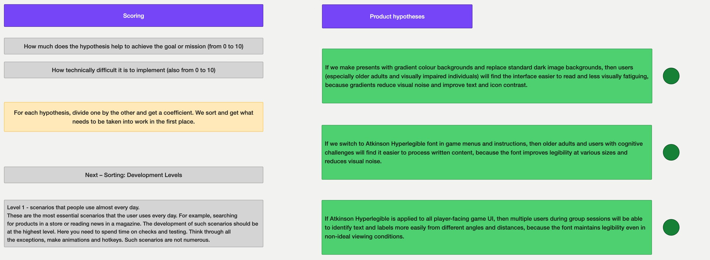
I built a MoSCoW framework with three lists to rank 123 ideas for the beta. Each idea's score is its value divided by build effort. Each idea also gets a development level from 1 to 3. Level 1 is daily use and gets the most care; level 3 only has to work.

‍

I ran a MoSCoW workshop with stakeholders and the developers. Nothing started as a Must-have. 38% to 48% of each list went to Won't have for the beta. Stakeholders then adopted the ranking as the team's way to prioritise.
‍

Spreadsheet titled MoSCoW Framework Score, System Interface Improvements, Beta. Columns: number, product hypothesis, Figma prototype link, MoSCoW priority, priority coefficient, development level and status, with an overview counting 0 Must, 8 Should, 10 Could and 11 Won't have. The top row, the Atkinson Hyperlegible typeface, scores 6.0.
My MoSCoW sheet for the system interface. Open the full sheet

‍

FigJam board. Left: the scoring rules, how much the hypothesis helps the goal from 0 to 10 and how hard it is to build from 0 to 10, divided into a coefficient, then sorted into development levels. Right: three If we, then, because hypotheses about gradient backgrounds and the Atkinson Hyperlegible typeface, each with a green decision dot.
Scoring rules and three green-lit hypotheses

‍

The 123 workshop ideas, by list. System interface29 ideas Should8 Could10 Won't11 · 38% Should 8 · Could 10 · Won't 11 (38%) Current games and apps71 ideas Should19 Could21 Won't31 · 44% Should 19 · Could 21 · Won't 31 (44%) New apps and features23 ideas Should5 Could7 Won't11 · 48% Should 5 · Could 7 · Won't 11 (48%) Must have: 0 in every listWon't have for the beta: 38% to 48%
The 123 workshop ideas, by list

‍

‍

‍

Design

‍

Touch targets for tremor, built from scratch

‍

I found no design system for people with tremor or dementia on a 55-inch screen. I turned 47 age-related changes into rules, then components. A target shows the press when a finger lands. The answer counts when it lifts. The table's built-in tremor filter tells a shaking hand from a real tap.

‍

Minimum touch targets, drawn to scale. 7 mmApple guidelines, 44 pt for phones and tablets 12 mmWCAG enhanced · 44 CSS px 4.1 × 6.2 cmAktivtisch keyboard key · 55″ 6.3 cmAktivtisch navigation button · 55″
Minimum touch targets, drawn to scale

‍

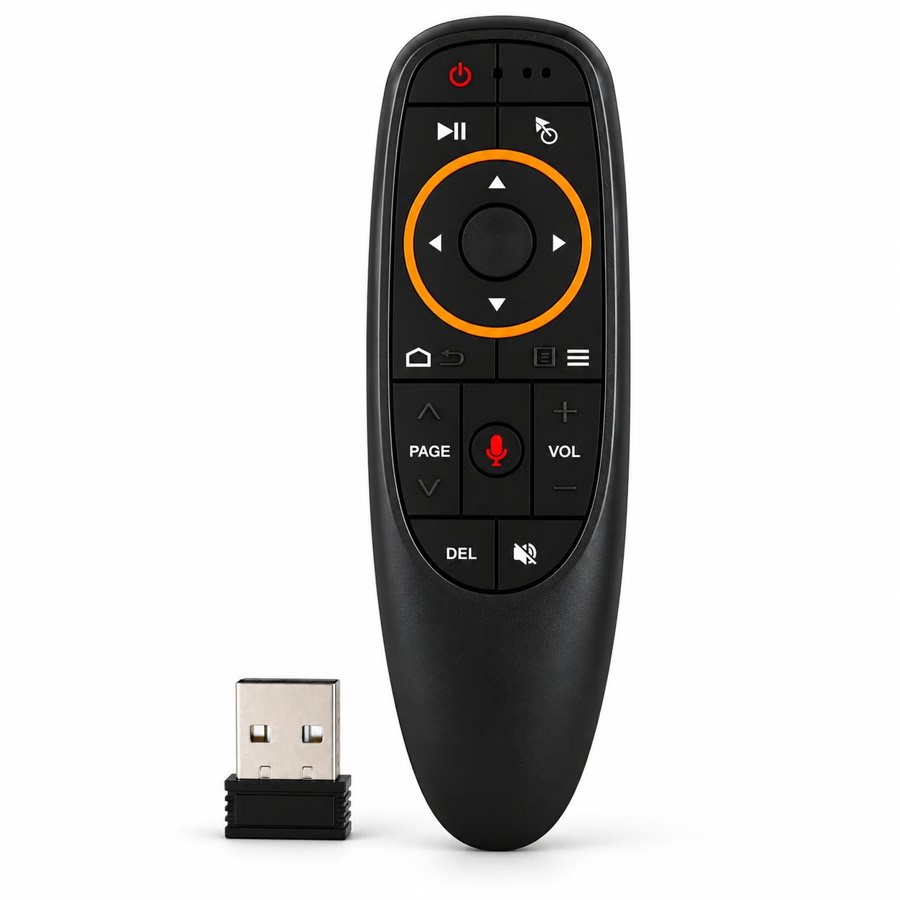
The Aktivtisch remote control with its USB receiver.
A remote for caregivers

‍

Every control also works with this remote's cursor.

‍

How it was tested

  • Two field visits in disability care
  • White headlines fell below 3:1 contrast on 9 of 21 pictures

‍

‍

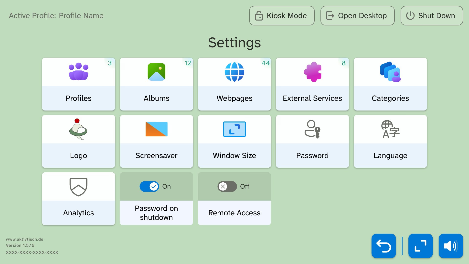
Settings on one screen, in three groups

‍

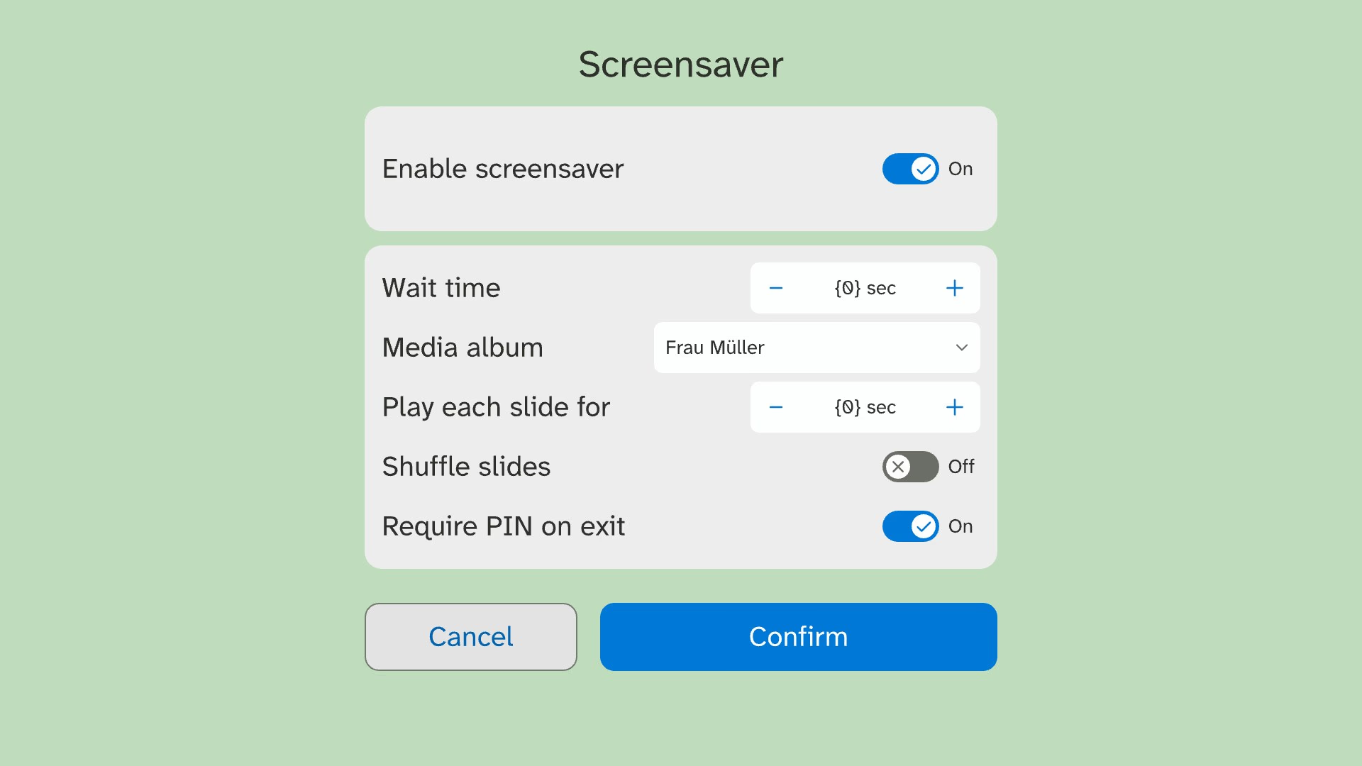
Full-size prints on the real 55-inch screen showed my dialogs 20–30% too large, so I shrank them.
‍

Redesigned settings home: a tile grid for Profiles, Albums, Webpages, External services, Categories, Logo, Screensaver, Window size, Password and Language, with toggles below and Kiosk mode, Open desktop and Shut down in the header.
The redesigned settings home

‍

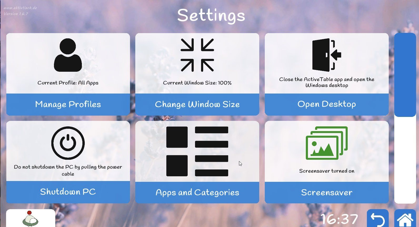
Legacy settings: six large tiles on a lavender photo background, including Open Desktop and Shutdown PC.
Settings before the redesign
Screensaver settings panel with an enable toggle, wait time and slide duration steppers, album picker and PIN-on-exit toggle.
Screensaver settings after the print test

‍

‍

Wizards for albums, web pages and the logo

‍

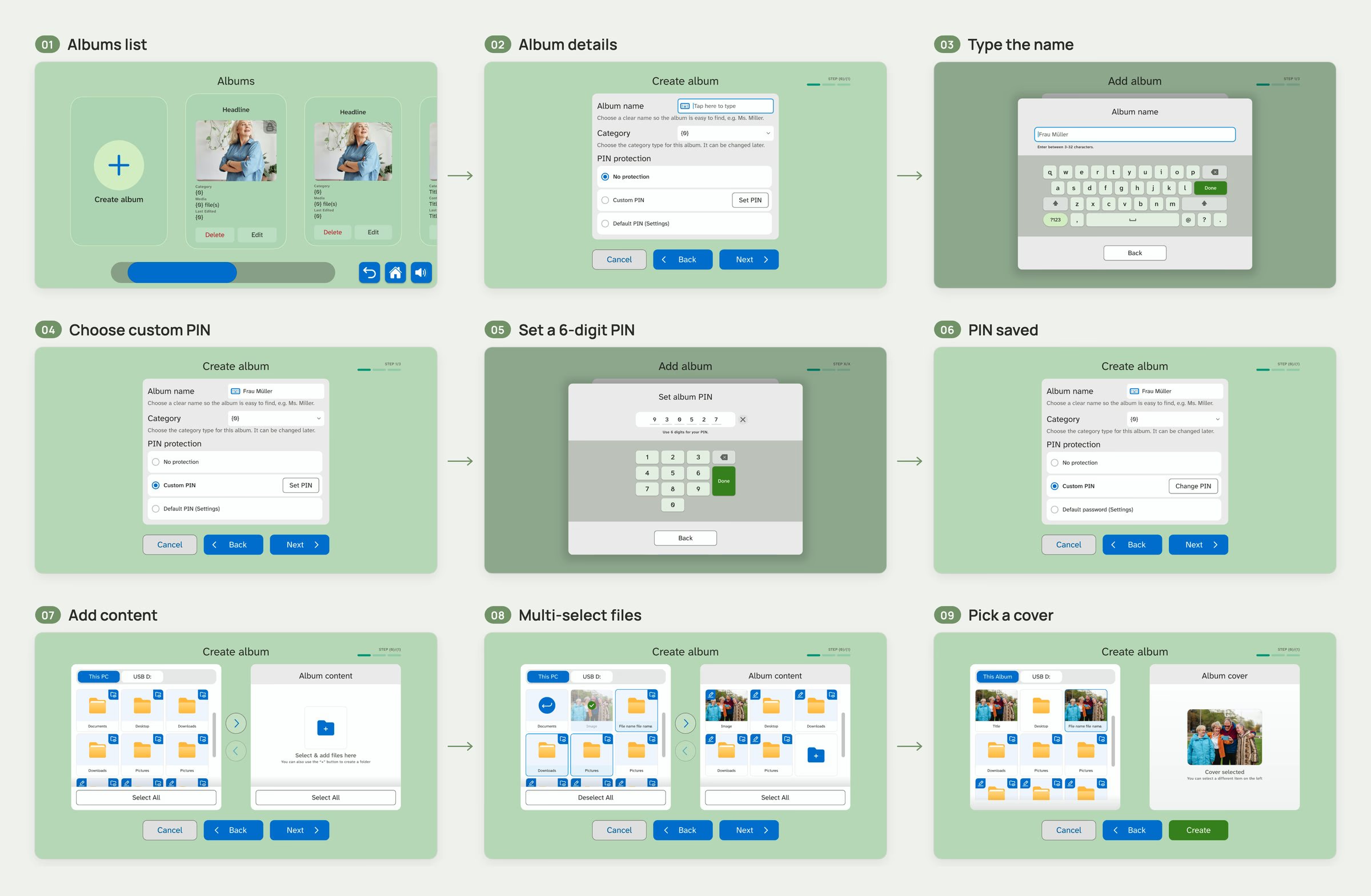
I turned each risky flow into a short wizard that asks one thing per screen. All three share one file browser, so caregivers learn it once.
‍

Creating a PIN-protected album

‍

Nine steps of creating a PIN-protected album: list, details, name, PIN choice, PIN pad, PIN saved, add content, multi-select, cover.
The album wizard, step by step

‍

Adding a web page

‍

The shared file browser

‍

Uploading a logo
Turning on the screensaver

‍

‍

Shut down

‍

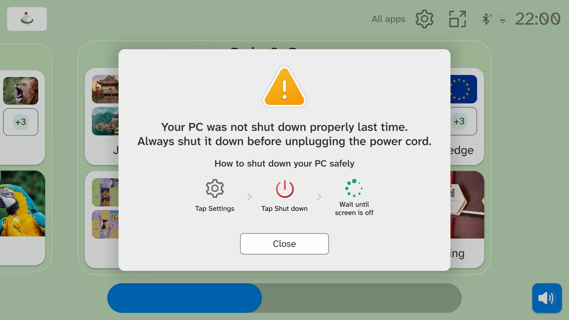
Caregivers unplugged the table because shutdown was tucked away in the settings and needed a long press. I made shutting down easy to find and turned it into a proper PC shutdown. If someone unplugs the table anyway, the next start shows how to shut down safely.
‍

Notice on the home screen: Your PC was not shut down properly last time, with three illustrated steps for shutting down safely and a Close button.
The notice after unplugging

‍

‍

Profiles in one short form

‍

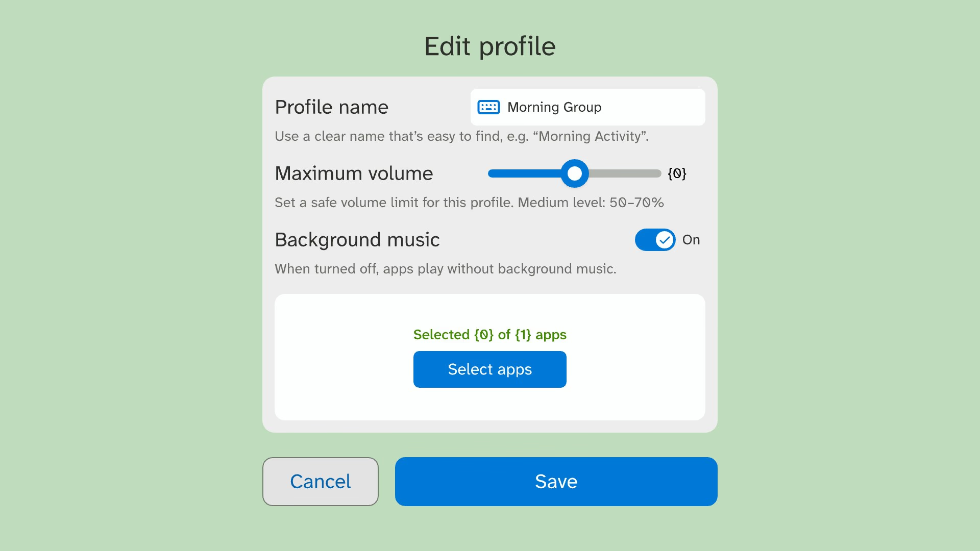
Facilities named profiles after sessions twice as often as after residents. So I made the form's example name a session, "Afternoon group".
‍

Edit profile form with a profile name field, a maximum volume slider with a recommended range, a background music toggle and the selected apps.
Editing a profile

‍

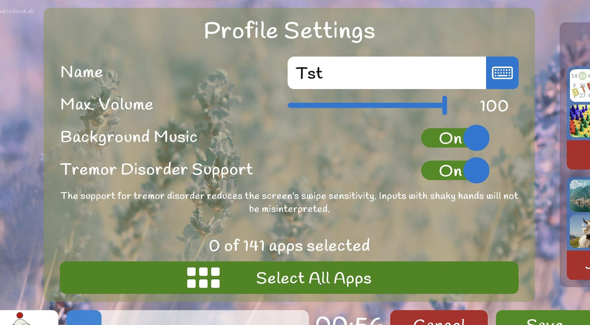
Legacy profile settings: name, max volume at 100, background music and tremor support toggles, and 0 of 141 apps selected.
Profiles before the redesign
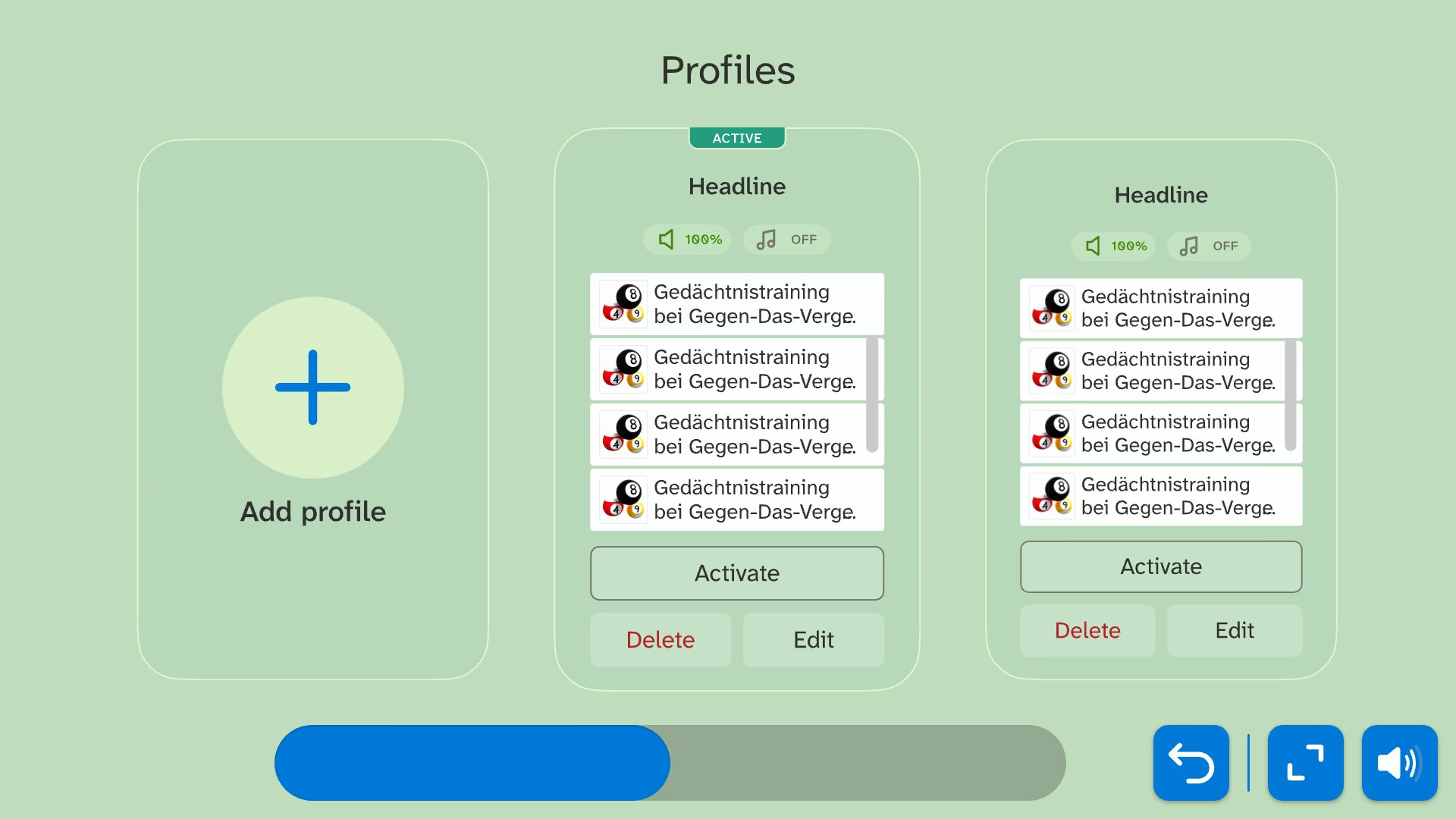
Profiles settings page: an Add profile tile next to profile cards showing each profile's volume, music setting and apps, with Activate, Delete and Edit.
Profiles after the redesign

‍

Creating a profile, with field errors

‍

‍

Consent and product keys

‍

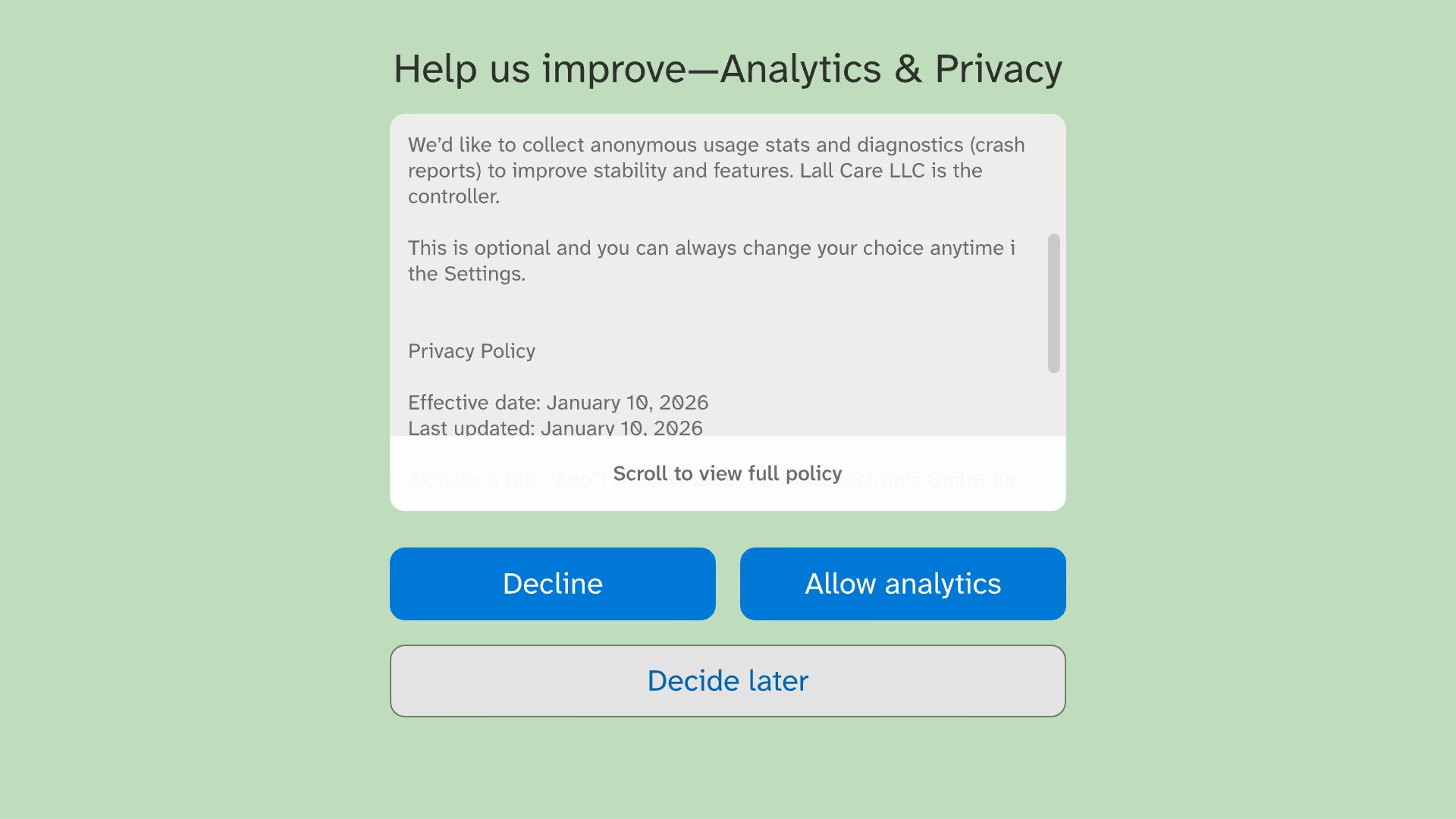
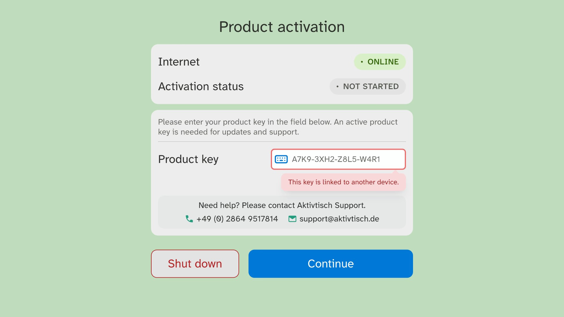
German law requires Decline to be as easy as Allow, so I gave both equal weight. I renamed licence keys to product keys. Their errors show under the field.
‍

Analytics consent dialog with a scrollable policy summary and Decline and Allow analytics buttons of equal size, plus Decide later.
Decline and Allow at equal weight
Product activation panel showing a rejected product key with an inline error under the field.
An invalid product key

‍

Dashes added as you type

‍

‍

A keyboard built for this screen

‍

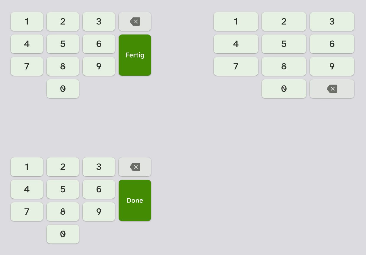
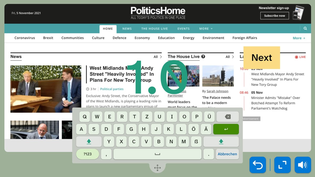
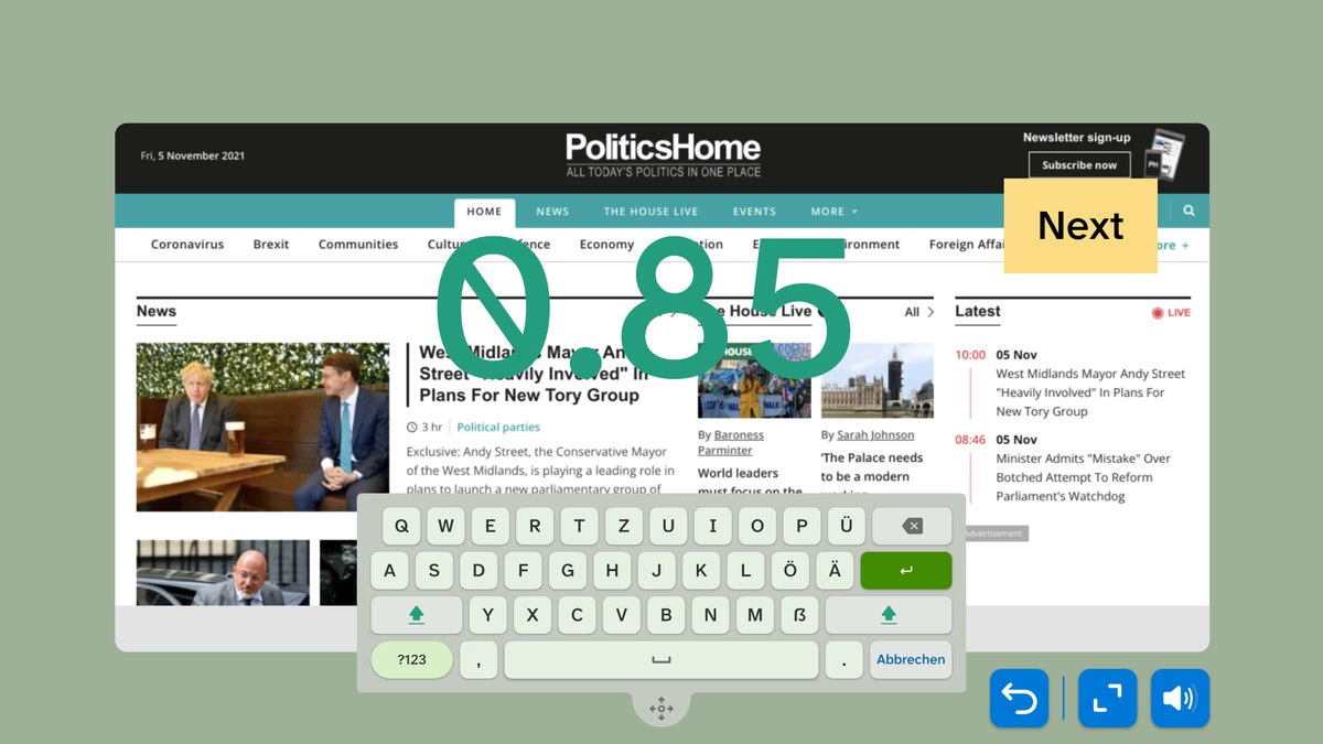
Typing is the slowest input on the table. I designed a custom keyboard with German, English, Chinese and Hong Kong English layouts.
‍

Done becomes active after three characters

‍

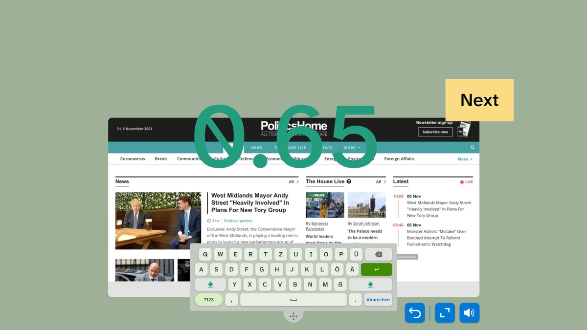
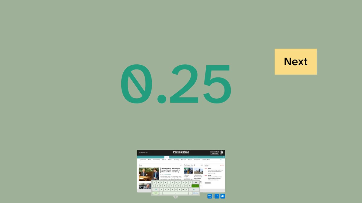
Floating keyboard over a news web page at full scale.The same layout at 85% scale.The same layout at 65% scale.The same layout at 25% scale, the smallest the window can go.
The floating keyboard, scaled 100% to 25%

‍

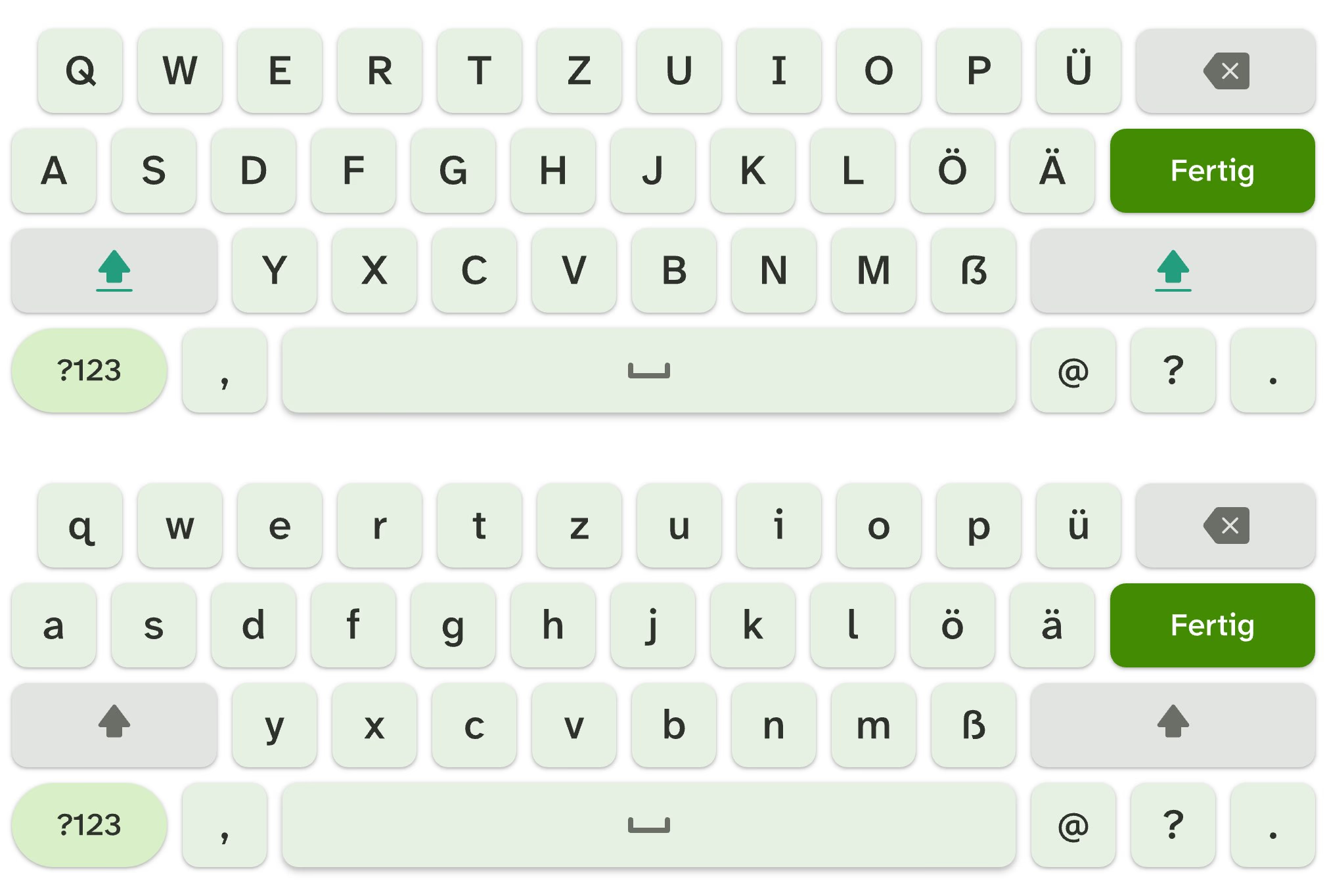
German keyboard component in capitals and lower case, with umlauts, sharp s and a green Fertig (Done) key.
The German layout
Numeric keypads for English and German with Done and Fertig keys, and a PIN pad.
Number and PIN pads

‍

‍

Six rules every game must pass

‍

In Test Your Knowledge, Guess the Saying and Black Sheep, a wrong answer was final. From the review, I wrote six rules for every game. Each game keeps its mechanic, and every round ends. No wrong answer is final, and difficulty lives in the content. Everything reads at three metres. Every main action has text and an icon.
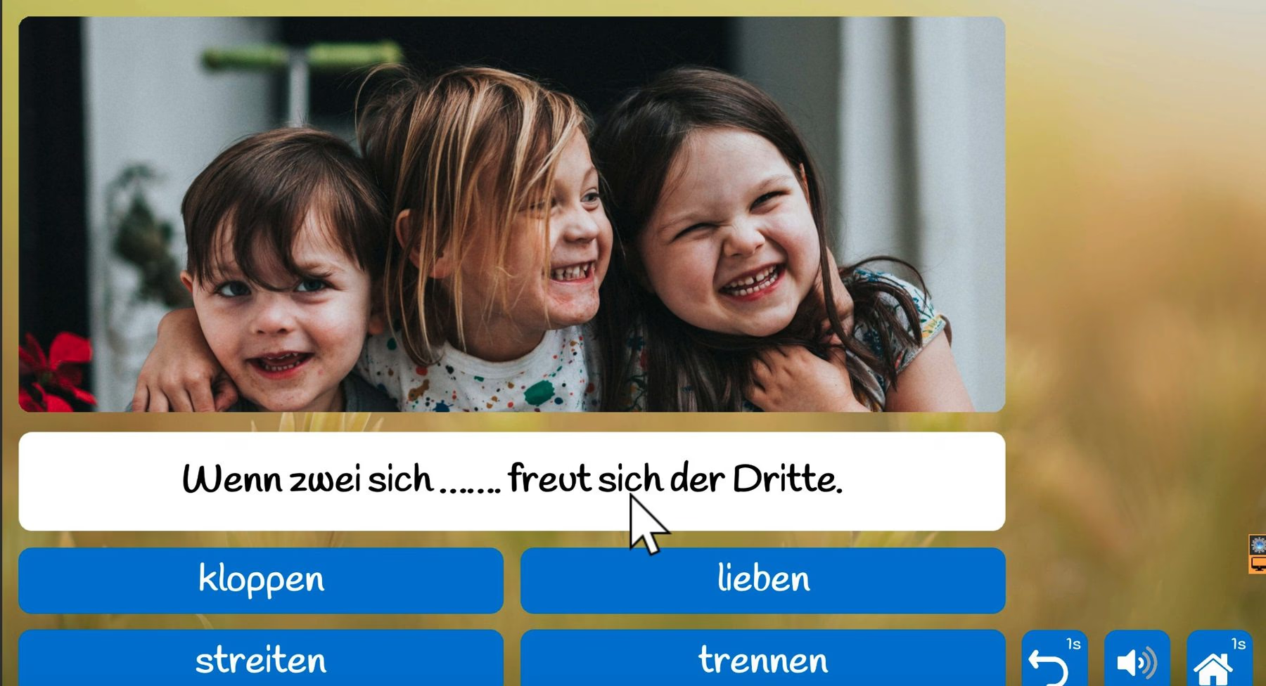
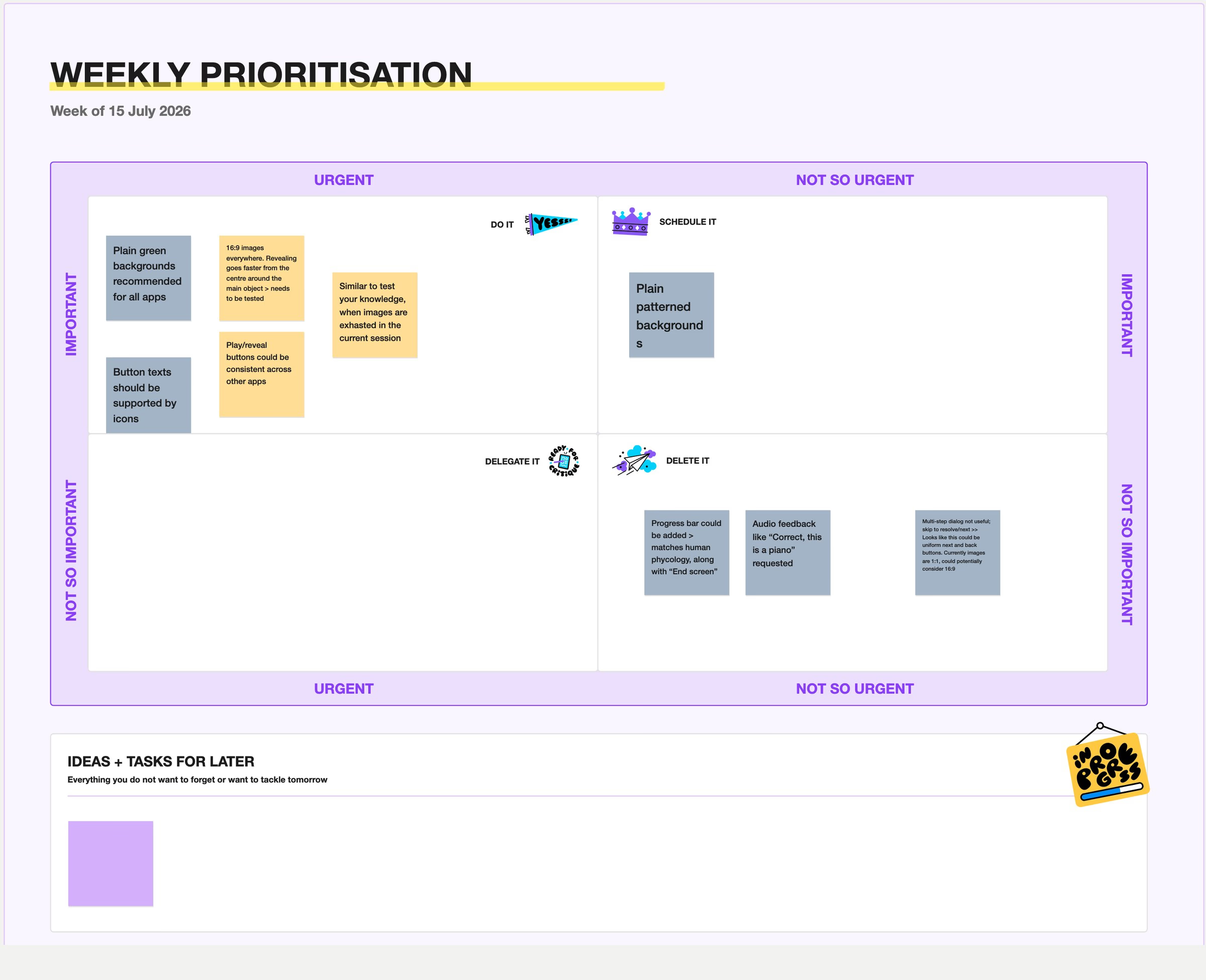
‍

A wrong answer, then the reveal

‍

Legacy saying quiz: a photo over a blurred field background and four text-only blue answer buttons.
The quiz before the redesign
Eisenhower matrix from FigJam sorting Look Sharp review findings into Do it, Schedule it and Delete it.
Weekly triage of Look Sharp findings

‍

‍

Consistent backgrounds with a human touch

‍

The review found busy backgrounds that hid the picture, and gloomy dark ones. Every redesigned game now sits on one family of light backgrounds in the brand greens. Hand-made SVG illustrations stay sharp on every table size. Each game gets a small motif at the edges, so the middle stays clear.
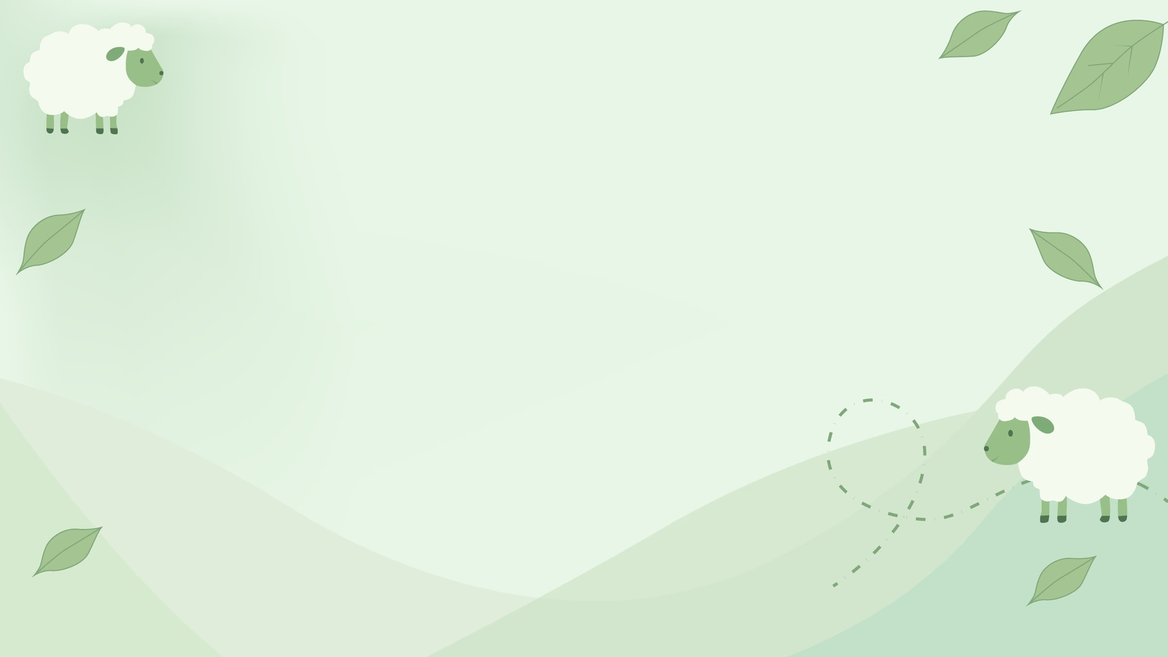
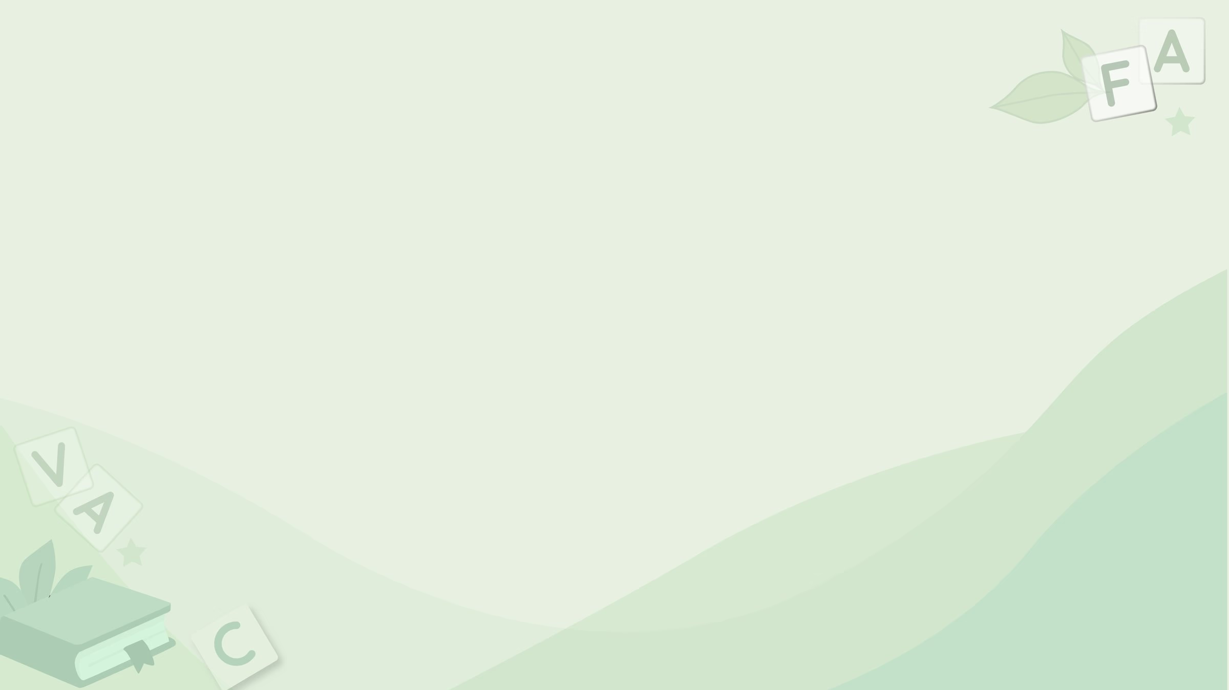
‍

Pale green Black Sheep background: soft green hills, two cartoon sheep in opposite corners, leaves and a dashed path, with the middle left clear for the game.
Black Sheep, where the family started

‍

Pale green wave background with letter tiles, leaves and a book at the edges.Pale green wave background with butterfly cards, leaves and an hourglass at the edges.Pale green wave background with music notes, a stave and sparkles at the edges.
The same family for the word games, Find Pairs and Singing

‍

‍

Game app redesign example: Black Sheep

‍

Caregivers did not know the three apps were levels of one game. I merged them into one tile, entered by topic, with levels inside. I set difficulty by how much of the picture changes. A soap dish at 18% is Beginner; an umbrella at 0.54% is Expert. I audited 83 library photos against that spec and rejected 45.
‍

A wrong tap, then the odd picture found

‍

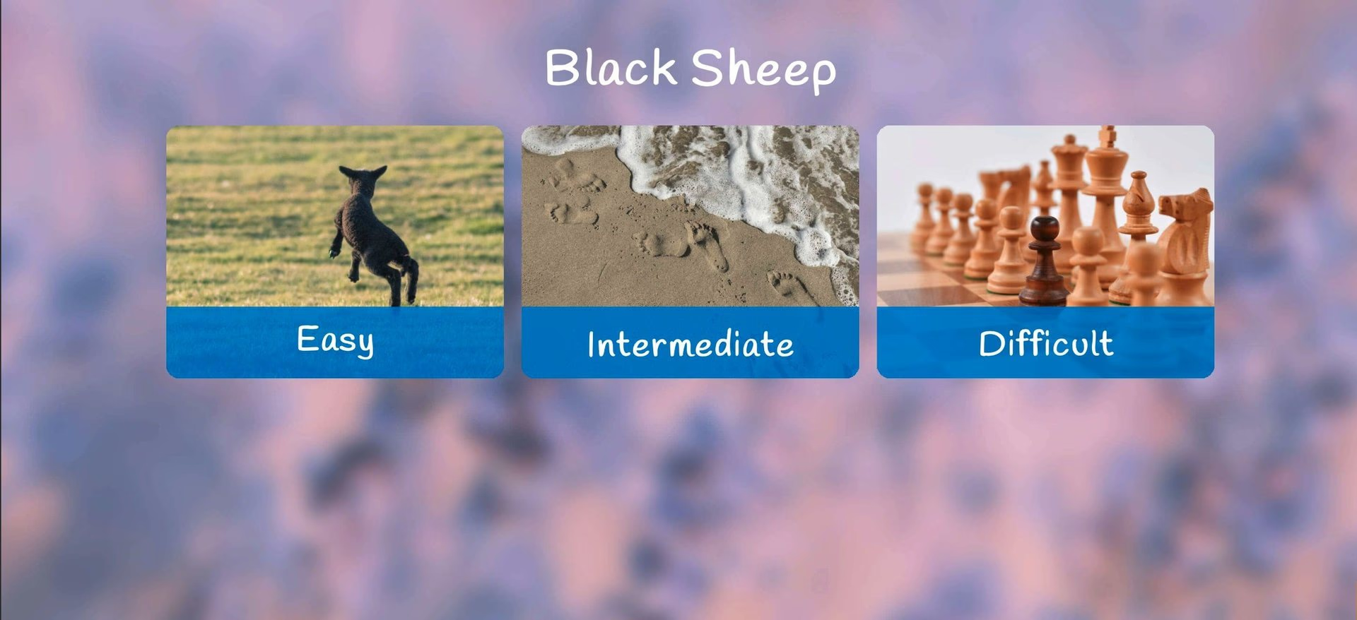
Legacy Black Sheep entry with three separate tiles labelled Easy, Intermediate and Difficult, each with an unrelated photo.
The three apps before the merge

‍

‍

Saving a painting with one field

‍

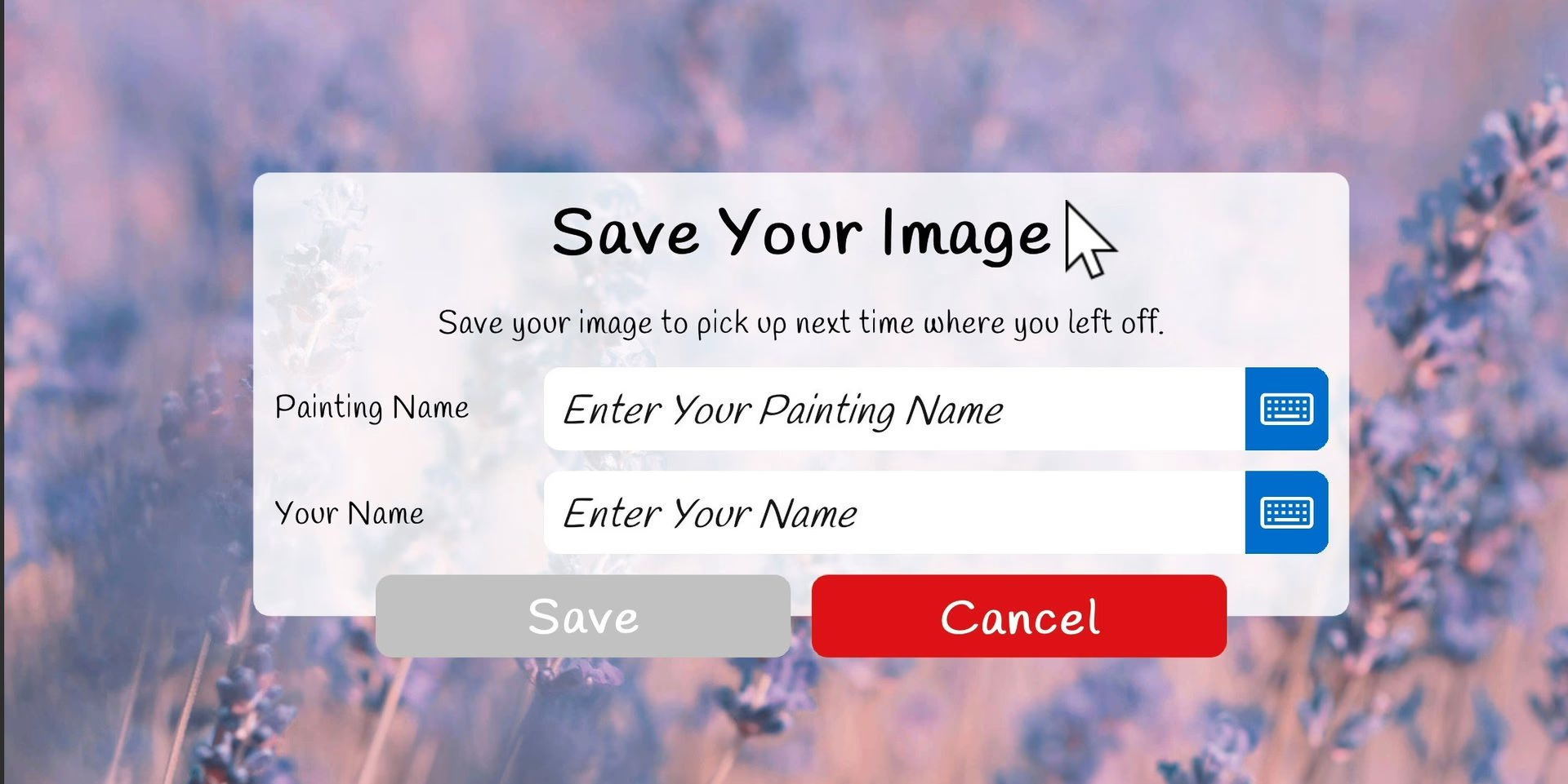
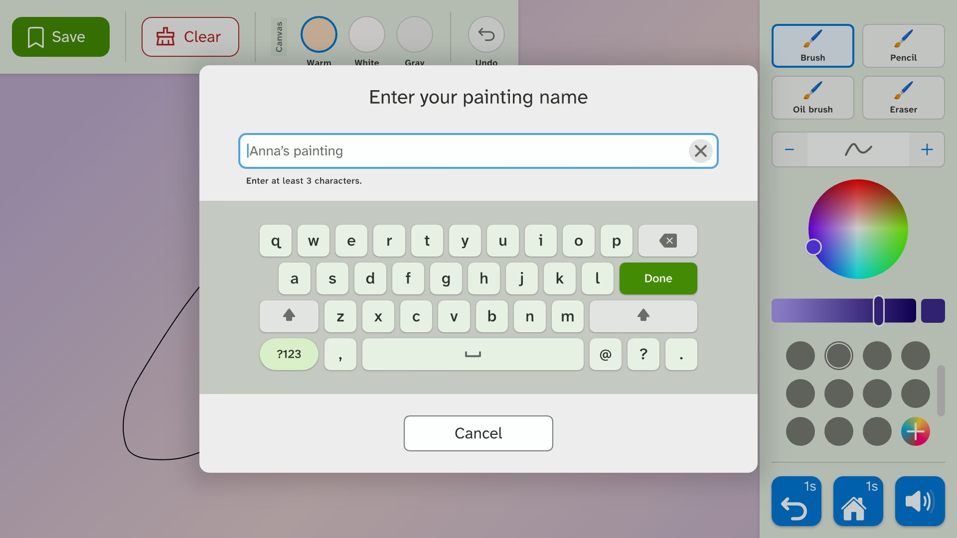
I removed the author field from the save dialog. With no name typed, the table names the painting after the profile, like "Anna's painting".
‍

Changing the canvas colour keeps the painting

‍

Legacy Save Your Image dialog asking for a painting name and the author's name, with Save and Cancel.
Saving before, with two fields
New save dialog with a single Enter your painting name field and the on-screen keyboard already open.
Saving now, with one field

‍

‍

One set of media controls for songs, stories and videos

‍

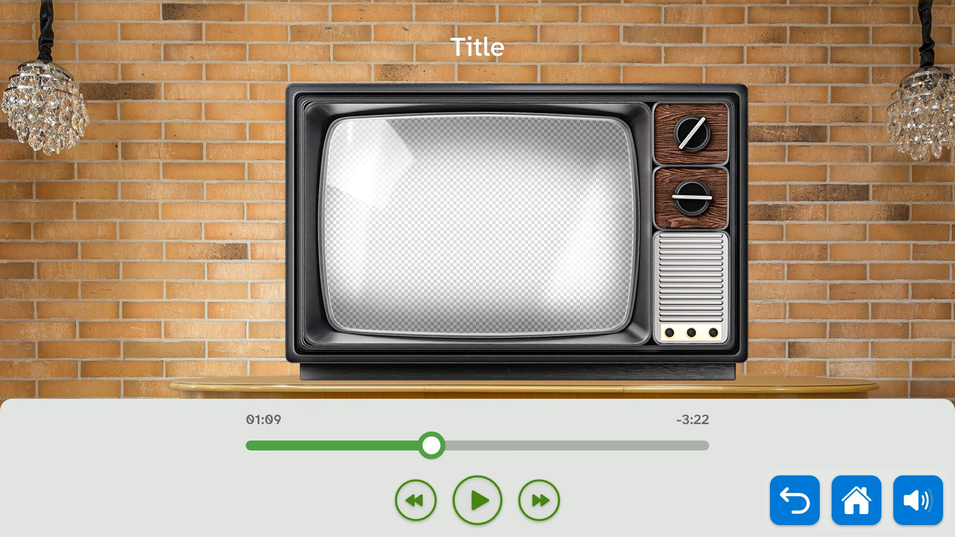
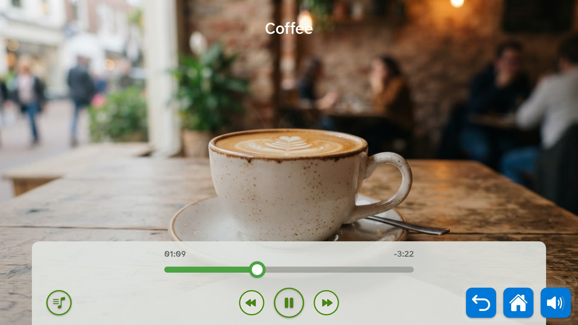
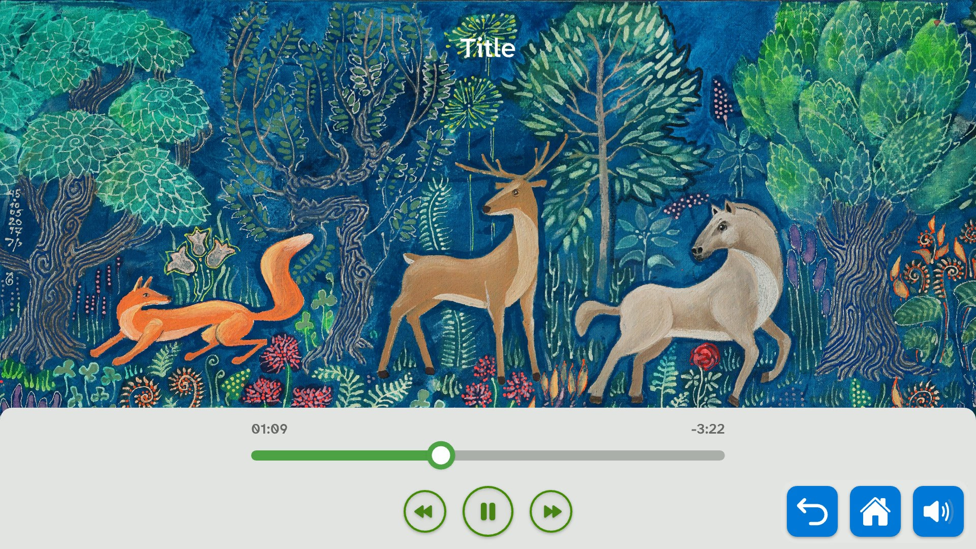
Singing, the fairy tales and Advertising Classics each placed their buttons differently. Now they share the same buttons, sizes and states. Lyrics follow the song and can be hidden to show the whole picture.
‍

Lyrics that follow the song

‍

Singing player with lyrics switched off, showing the full illustration and the shared controls.Fairy tales player paused, using the same control bar.Advertising Classics video playing inside a drawn retro television, with the same control bar below.
The same controls in three apps

‍

‍

‍

Test

‍

Testing on the table itself

‍

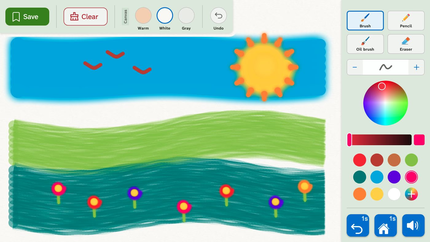
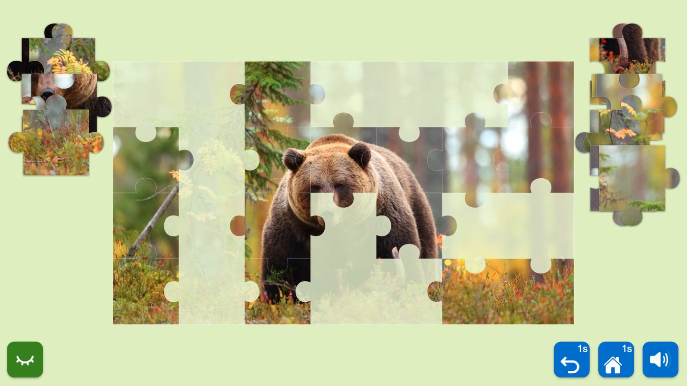
I coded prototypes for nine apps and made 25 offline test builds. On the table, a one-second long-press that worked with a mouse failed under a real finger. The builds also needed true full screen and an exit button for touch. Slideshow text and controls match the design within one pixel.
‍

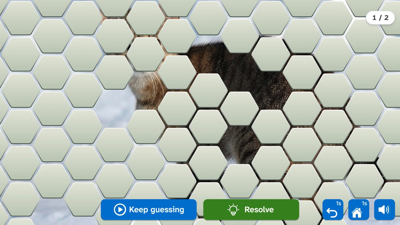
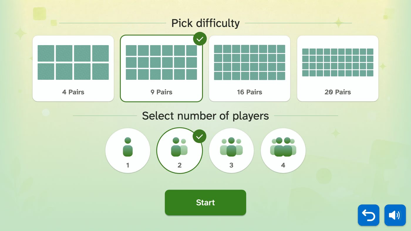
Painting prototype: a landscape painted on the White surface with the fixed tool rail.Jigsaw prototype: a bear puzzle half assembled with loose pieces in side trays.Look Sharp prototype: a paused reveal with Keep guessing and Resolve.Find Pairs prototype: choosing the number of pairs and players before the game.
Four of the nine coded prototypes

‍

Slideshow autoplay and cross-fade

‍

‍

‍

Deliver

‍

A design system the developers can build from

‍

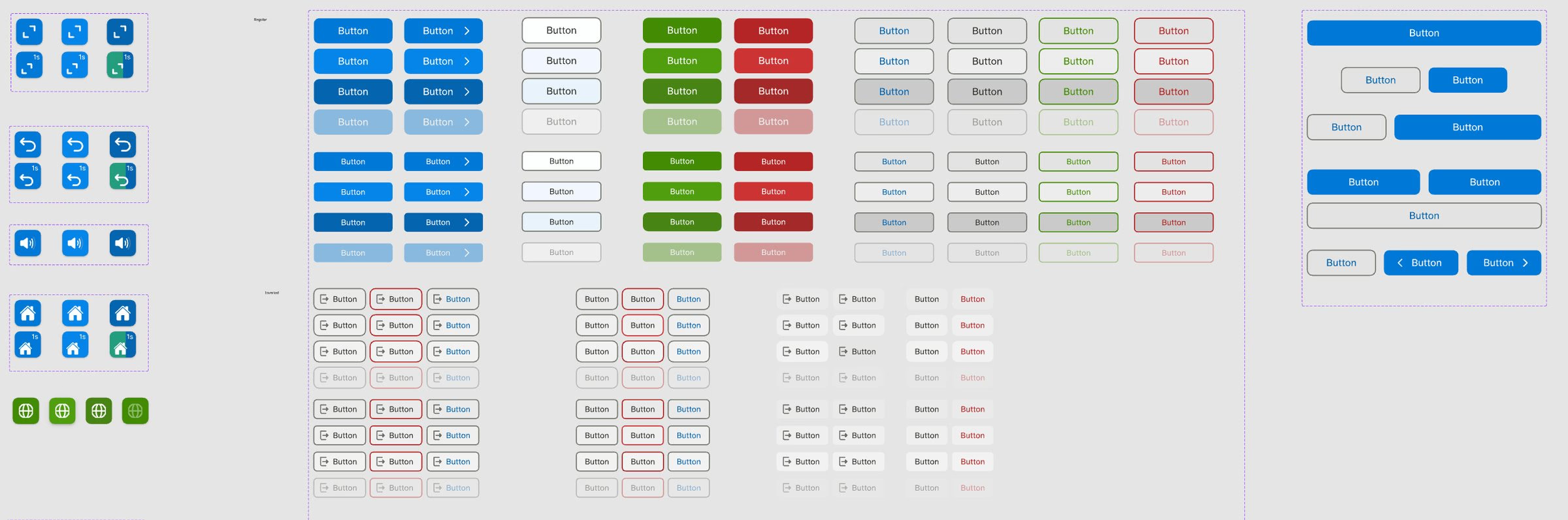
In Figma, I built the Master File with about 1,600 components and variants. In Confluence, I wrote the UI guide on how the interface behaves and why. Every screen uses a 16-column grid with a 24 px safe area. The developers build each new app from tested components. The aim is a consistent product that scales, with less mess and cheaper releases.
‍

Master File button sheet: navigation buttons with a 1s long-press badge, and regular, outlined, green and red buttons in default, hover, pressed and disabled states.
Button states and the one-second hold badge

‍

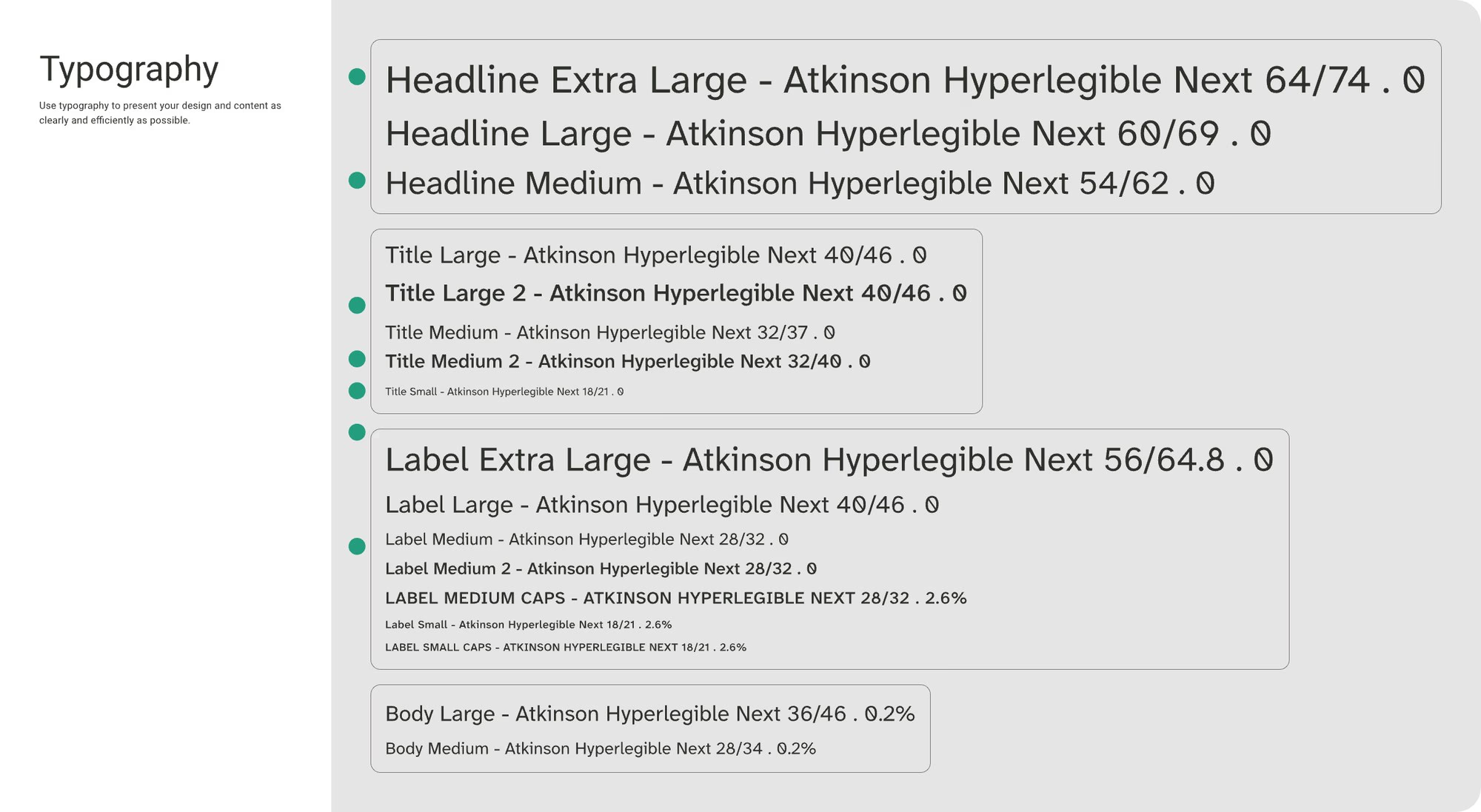
Typography styles in Atkinson Hyperlegible Next, from headline to body sizes with line heights.
Type scale in Atkinson Hyperlegible
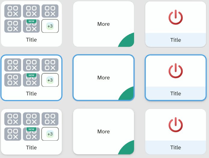
Card components in default, focused and pressed states: category cards with a NEW badge and a +3 overflow tile, a More card, a shut-down card and photo and folder tiles.
Default, focused and pressed cards

‍

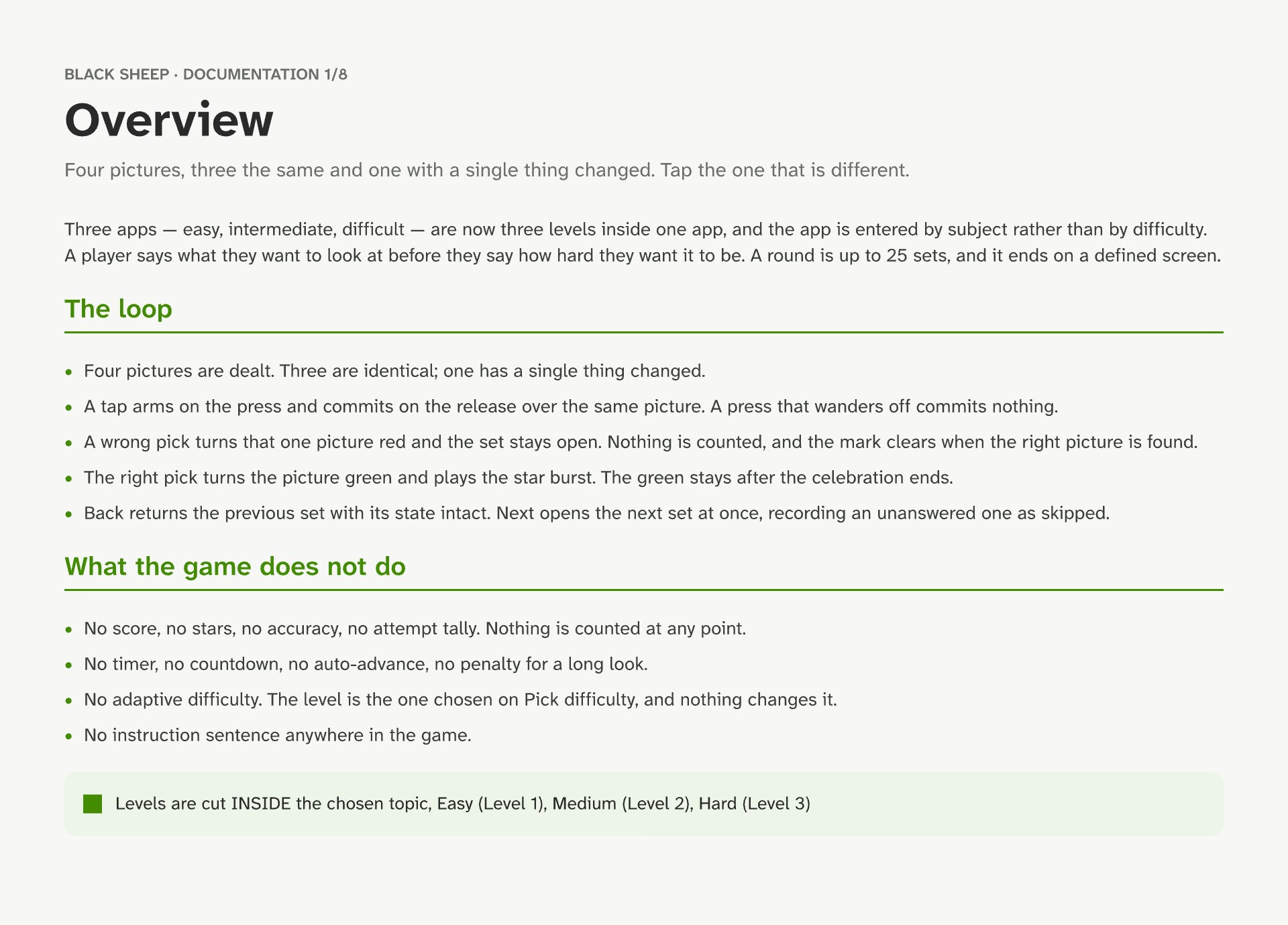
Documentation board titled Overview, explaining the Black Sheep loop and what the game does not do, in plain language.
Documentation board for the developers

‍

‍

Localisation in three languages

‍

The table ships in German, English and Chinese. German runs about 40% longer than English, so I gave every text slot a length limit. I wrote notes with a character counter for the content designer. All 1,291 imported German questions fit their slots.

‍

From copy to build. Step 1WriteWhoI write the English copy in a sheet until it is final Step 2TranslateTranslation toolGerman, then other languages, within each slot's length limit Step 3Push to FigmaPluginTranslations land on the real screens, one page per language Step 4Check fitRuleText that does not fit is shortened, never shrunk Step 5BuildUnityApproved text goes to the developers, number slots included
From copy to build

‍

‍

AI for prototypes, then design by hand

‍

I used AI only to build coded prototypes fast. Each one showed the developers how a screen should behave. Then I revised every design by hand in Figma.

‍

Animation, all custom. I designed every animation to a few timing rules. Screens cross-fade in 350 to 450 ms, and rewards get more time. The Black Sheep star bursts over the odd picture and is gone within 1.8 seconds.

‍

‍

‍

Brand

‍

One brand and customer experience

‍

I treated the brand as the whole customer experience. A care home meets Aktivtisch online and in print, then uses it every day. I art-directed the brand book and the January 2026 photo shoot with real residents. I also designed the new website concept. The logo set and flyers were made with an external designer. I chose Commissioner and Source Sans 3 for the brand, and Atkinson Hyperlegible inside the product.
‍

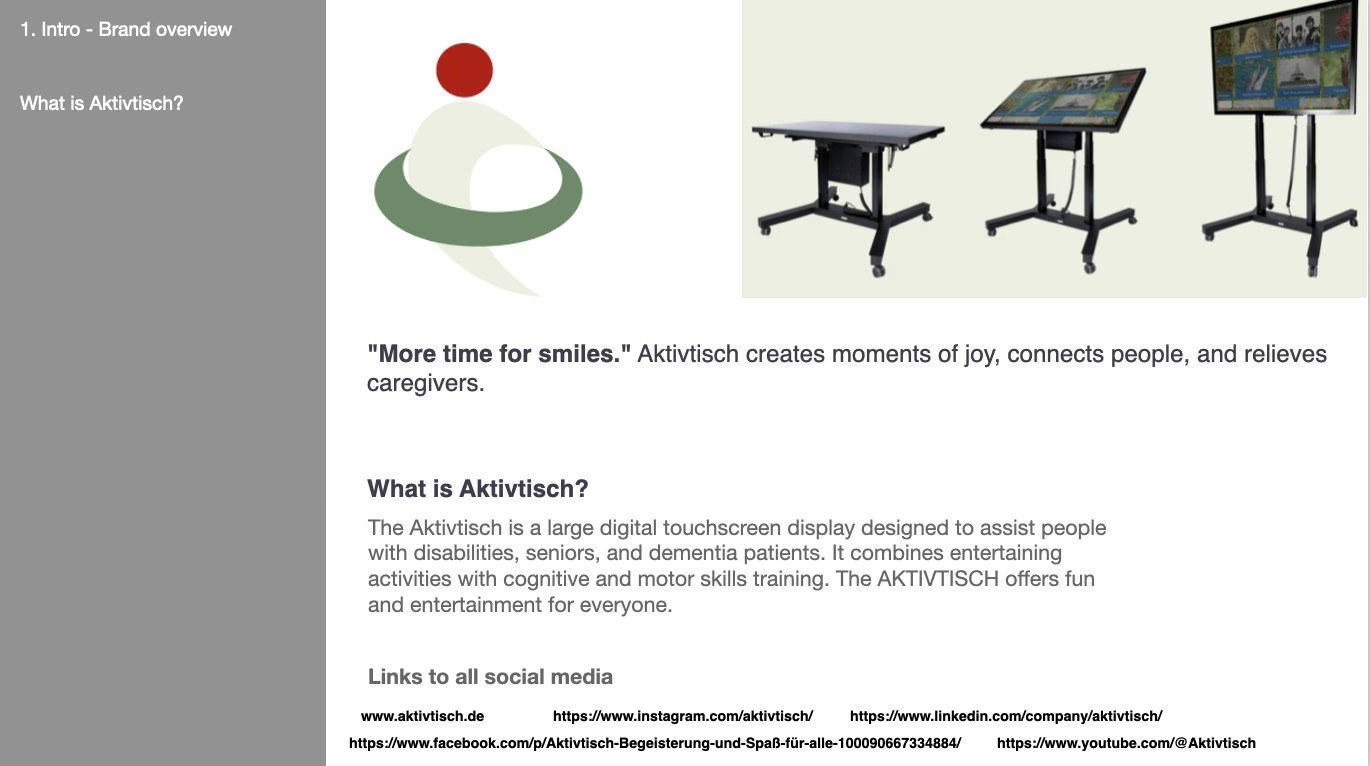
Brand book page introducing Aktivtisch with the symbol, the three table models and the line More time for smiles.
The brand book overview

‍

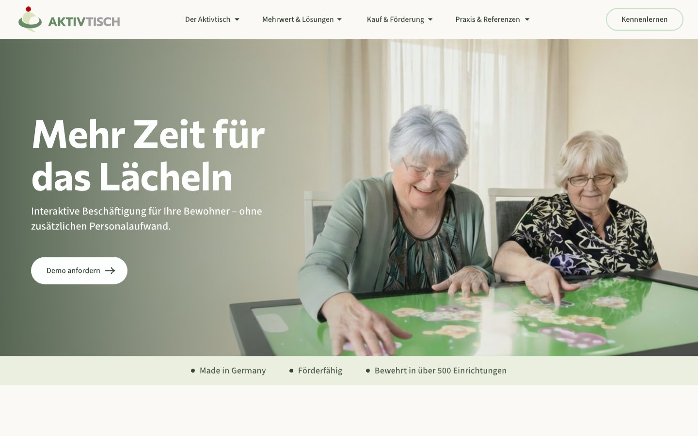
Homepage concept: Mehr Zeit für das Lächeln, interactive activities for residents without extra staff time, a Demo anfordern button, over a photo of two residents playing at the table, with Made in Germany, Förderfähig and Bewährt in über 500 Einrichtungen below.
The homepage concept, first screen

‍

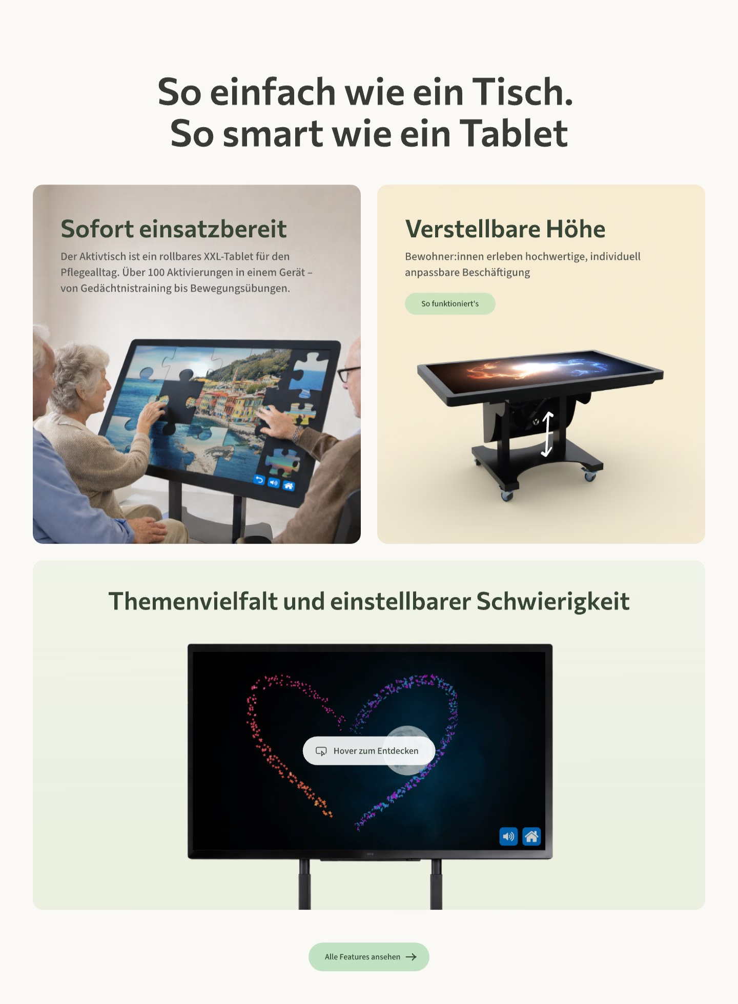
Homepage section So einfach wie ein Tisch, so smart wie ein Tablet, with cards for ready to use, adjustable height and a range of themes with adjustable difficulty.
What the table does, in three cards
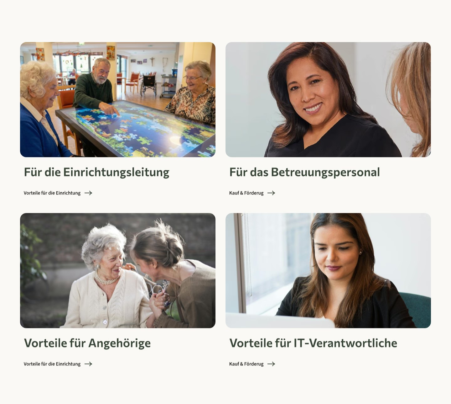
Four photo cards: for facility management, for care staff, benefits for relatives and benefits for IT managers.
Pages for management, care staff, relatives and IT

‍

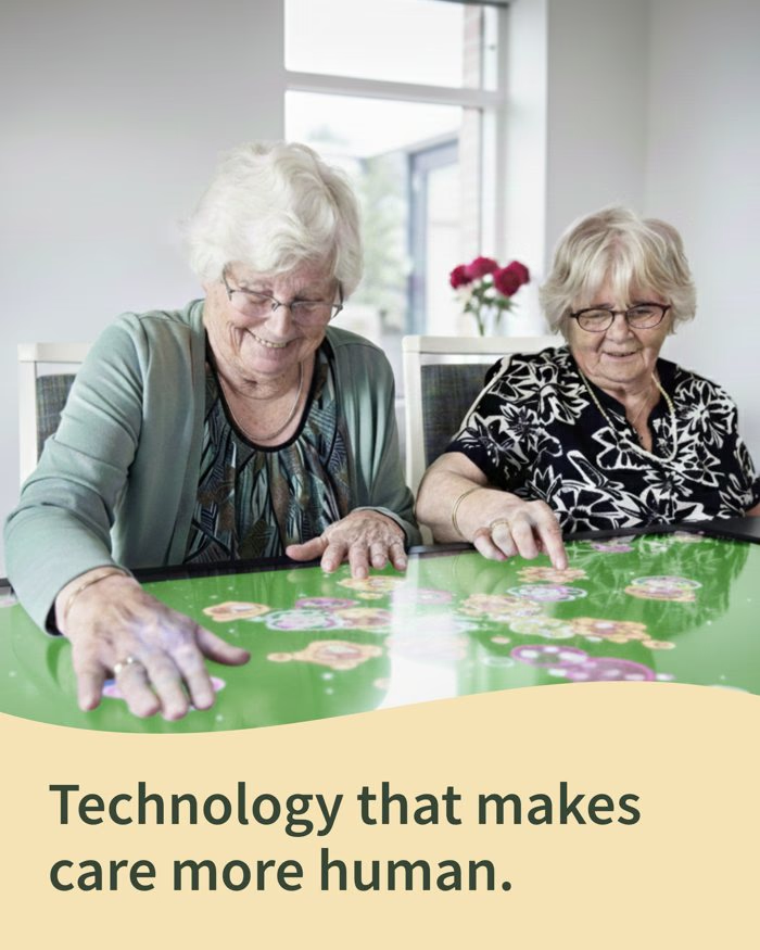
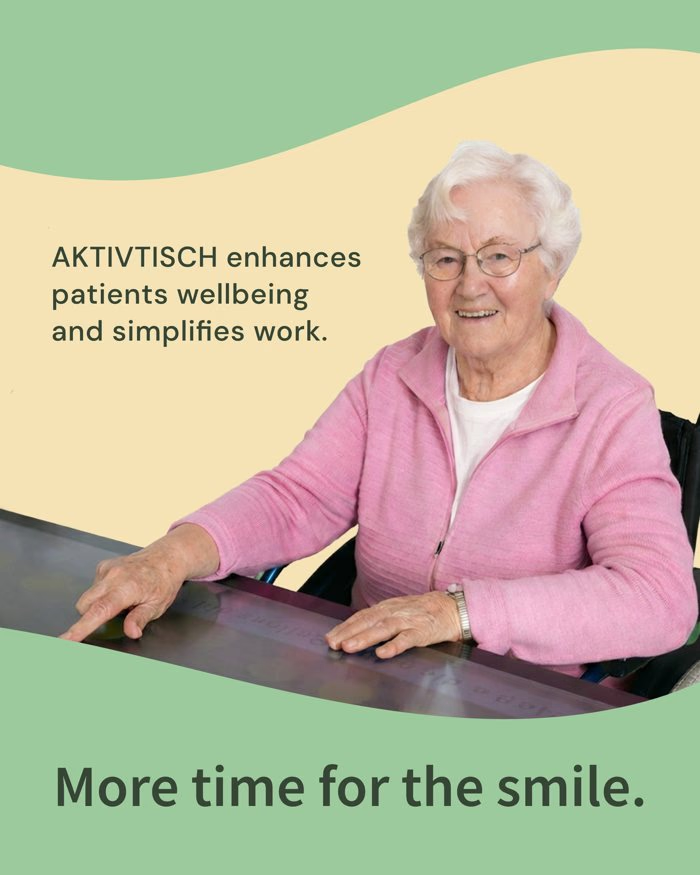
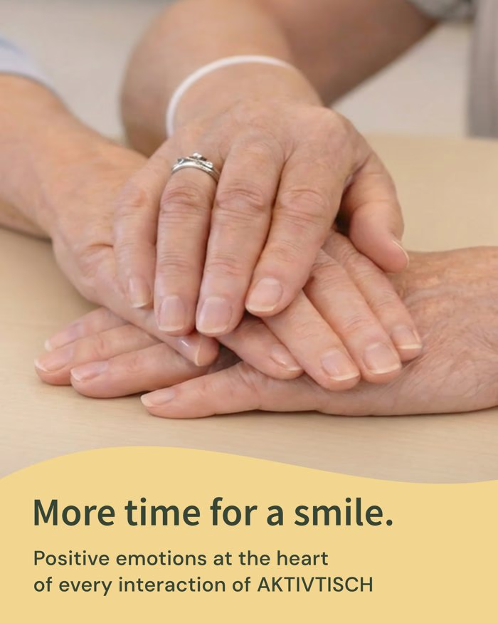
Social post: two residents at the table, Technology that makes care more human.Social post: a resident smiling, More time for the smile.Social post: hands resting together, More time for a smile.
Social templates

‍

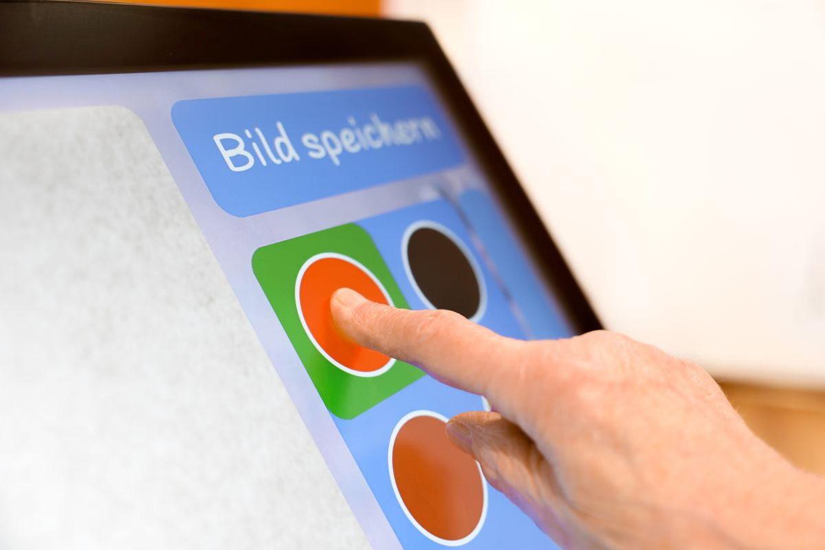
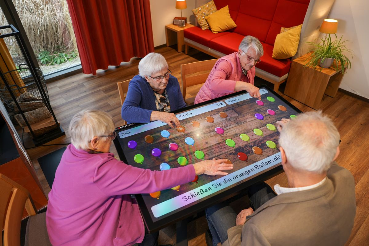
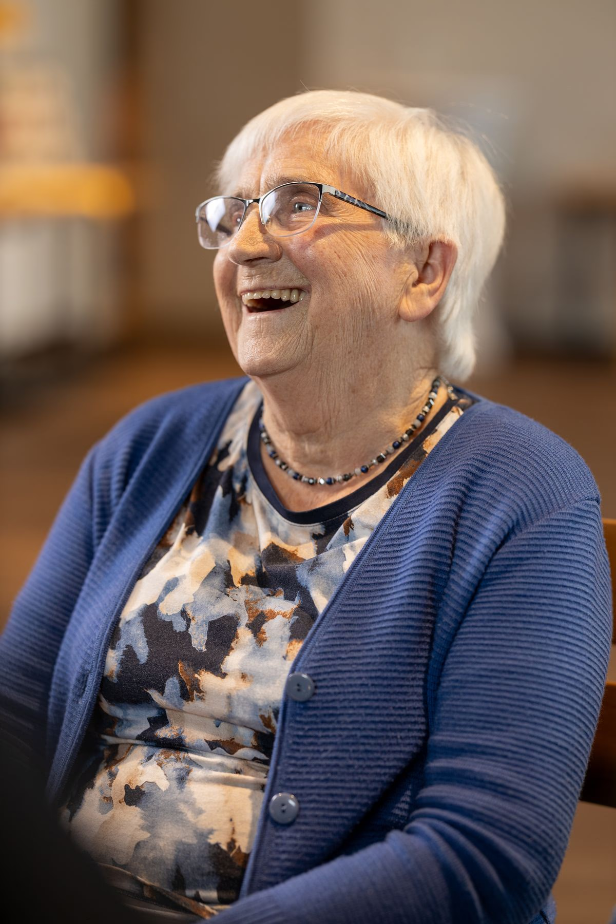
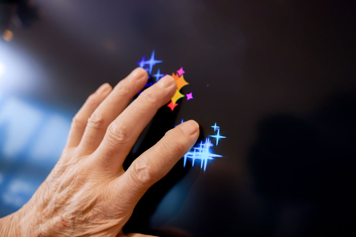
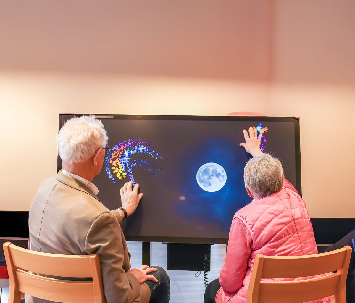
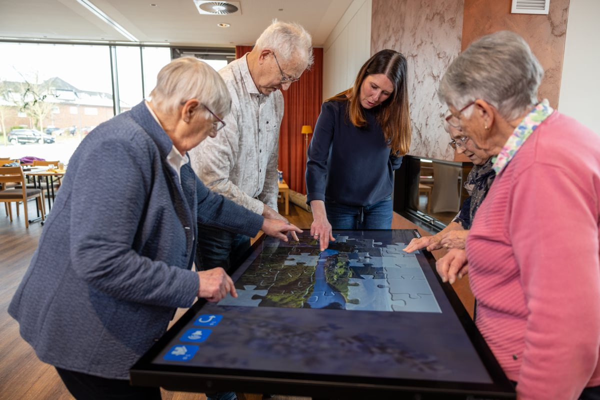
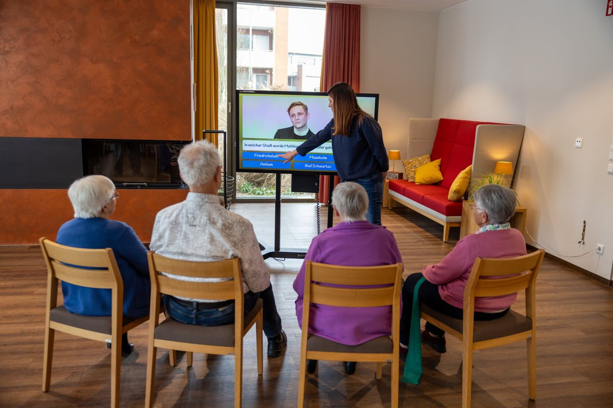
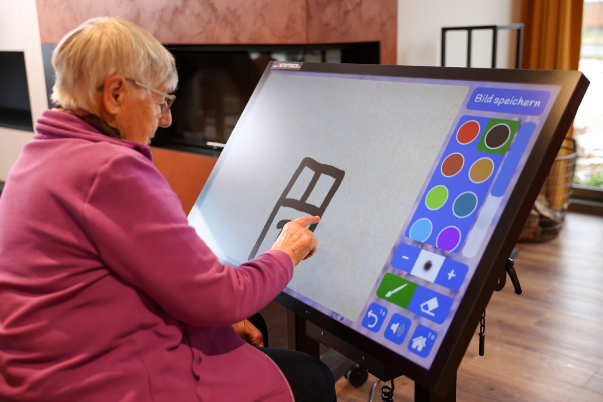
Close-up of a finger choosing a colour on the painting app.Residents playing together around the tilted table, seen from above.A resident laughing.A hand on the dark screen with sparkles where the fingers touch.Two residents touching the upright screen during a group session with sparkles and a moon.A caregiver and four residents assembling a jigsaw together on the flat table.Residents seated in a row while a caregiver runs a quiz on the upright screen.A resident painting on the tilted table with the colour palette beside her.
The January 2026 photo shoot

‍

‍

‍

Measure

‍

Measuring what keeps care homes using the table

‍

Content that never changes wears residents out. I proposed smaller, more frequent updates of about 1 GB each, and stakeholders made them monthly. Each update is a retention hook, and NEW badges on Home point caregivers to the fresh content.

‍

Regulations make care homes hard to visit, so every table reports its daily use. Counting opens of 15 seconds or more filters out accidental taps. Tables that stay offline store each day and send it later. I designed the consent with Decline as prominent as Allow.
‍

Consent, sharing off, deletion requested

‍

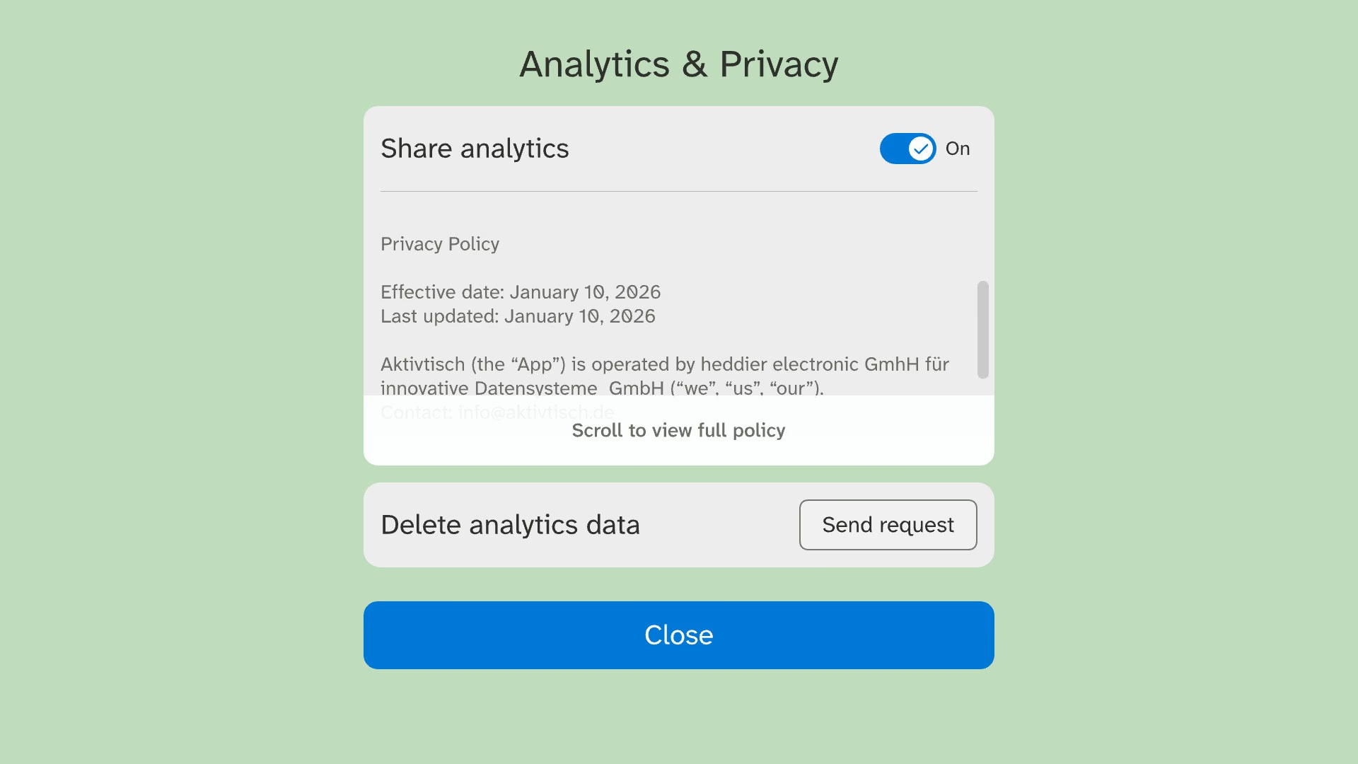
Analytics and privacy settings with a sharing switch, the privacy policy and a Send request button for deleting analytics data.
Privacy settings for sharing and deletion
Home tiles with NEW badges on photos added in an update and +3 and +2 overflow counters.
NEW badges on fresh content

‍

‍

What I learned

‍

Prioritise with one shared score.

I gave all 123 ideas one score, value divided by effort. In the MoSCoW workshop with stakeholders and the developers, nothing started as a Must-have.

‍

Ship the necessary first.

Settings and shutdown went first, because the survey showed caregivers struggled there every day.

‍

Cut what does not pay its way.

A full redesign of the old apps, about six months of work, became light fixes.

‍

Keep stakeholders aligned.

Every decision went into Jira, so the team worked from one record. Sales joined early and used the survey to show that staff unplugged the table. That finding made shutdown easy to find.

‍

‍

03
2024

Mercedes me App

Man using his phone beside a silver Mercedes SUV, next to a redesigned dark Mercedes me app dashboard
View more
View more
View more
View more

My unusual user research that proved useful for Mercedes-Benz

UX/UI
Design Thinking
Research
Design System